Saturday, July 30, 2011

Green Go

The wet grass poultice was directly pressed into the paper.

Here is the fourth anthotype; one of at least two made with grass pigment. This one is grass stained instead of a brushed on liquid due to the qualities of the paper. It was tedious but [I hope] it will introduce artifacts from the the hammering of the grass poultice directly onto the paper. The other grass anthotype to go in the third window (closest to the brick work in the last picture) on Tuesday will have a brushed on emulsion.

Friday, July 29, 2011

always greener on the other side

You may be familiar with the expression "The Grass is Always Greener On the Other Side". Imagine a 40" x 36"  sheet of paper in which the green of the grass stain is greener on one side. Imagine me in my studio wrestling with said paper. I've unintentionally created, at least as of this afternoon, an homage to Mark Rothko. Below is an image from last night.


As of a few minutes ago I think I corrected the issue. Now I just need to remove the larger chunks of grass that I don’t want in the final photogram. The rose petal anthotype came down last night. I haven’t had time to document it but take my word, after an 18 day exposure it looks fantabulous. During the class visit to my studio, Cynthia Fowler noted appearance of a family of anthotypes in the making.

Now for a little shameless self-promotion. The Ohio State Fair Fine Arts Exhibition is now open and will run until August 7th, 2011. Juror Eric Weeks has selected “Apple” for one of the three Juror’s Choice Awards in the professional division. For the complete list of award winners in both the professional and amateur divisions, please visit http://theohiostatefairfineartsexhibition.blogspot.com/2011/07/2011-award-listing.html.

Thursday, July 28, 2011

Grass Green and a Fugitive Pigment

They  cut the grass on the Emmanuel College campus yesterday so I went into manic mode. Wet grass clippings is chance favoring the prepared studio artist.

Mainly pictures this today. After an initial success, I have been struggling with using grass as a pigment for the Anthotypes. The first one, because of the quality of paper and five coats, worked out well. This was coated days ago before the lawn mower cuttings became available (yesterday). It is just waiting for the subject to arrive in the mail which is the fodder for a future blog entry. The second and third attempts are another story. I will let the captions do the talking. Besides the green, I have a discovery to report. The rose pigment is very sensitive to ambiant light i.e. fugitive! Please see the last picture.

The first attempt at grass which worked out well due to five coats of emulsion and the quality of the paper. Note the two other anthotypes in the upper background.
The Utrecht drawing paper soaks up emulsion and shows streaks. This is actually grass poultice pressed on top of the paper. In the photo above you can see this along with the second attempt.  
Red rose pigment exhibiting signs of pattern fading after two weeks exposure to room lights.

Wednesday, July 27, 2011

Experiments from the Garden of Roses, Part II

Anthotype science. I like this kind of stuff.

The rose petal extract demonstrates a classic pH indicator color change. I wish I had a pH meter to compare my guesses but for now these estimates will have to do. I noticed that when I washed out anything that had been in contact with crushed red rose petals, it would turn the water blue which would be around pH 7. Last week when I suspected the leftover rose petal extract was oxidizing to a brown, I added a classic food preservative, citric acid, to the fresh rose petal emulsion. It went from a cool red (pink red) to a warm red (crimson). Yesterday evening I again added citric acid to the latest batch of red rose petal emulsion and saw the warm red effect. In washing out one of the beakers I created about 3oo cc of faintly blue water into which I added a pinch of citric acid. It shifted the water to a faint red before it went clear. Now the question is, what was the pH of the pinch of citric acid in water that I created? Probably pH 4-5.

In creating some green Anthotype emulsion from grass, I noticed that adding citric acid created more of a brown green or olive color and possibly contributed to flocculation. For the grass I am probably going to just use distilled water and crushed leaves (blades). As of yesterday, the sheet of paper I have coated has about 5 coats of green applied to it.

Pictures soon. Of immediate concern is tracking down some coffee this morning.

Saturday, July 23, 2011

perhaps something in purple?


Here is the second anthotype taken down from the window last Thursday. A few reviews alluded to drawing characteristics. It is a photogenic drawing (in purple). The iris petal emulsion was applied drop by drop (yes, I’m nuts) onto Kochi washi paper. Hence the pattern. The pajama was red fleece with trains and no name on it. If you have a suggestion for a title, I’m all ears.

BTW, I have been adding a dash of citric acid as a preservative to my latest flower pigment emulsions (in solution). Today I noticed that the red roses I was grinding up returned to their warm red shade with citric acid instead of the cooler red / purple with just water.

Friday, July 22, 2011

Mulberry Pigment Print


This is the first anthotype to be completed at the residency. Mulberry pigment coated onto Utrecht drawing paper and exposed for 27 days (with about 5-7 cloudy days). Tentatively titled "Charles Tesconi". The yellow one is now installed in the window and appears to be fading quickly. The rose petal anthotype should be ready for unveiling next Thursday.

the opposite of instant gratification


Today I will budget in time to document the two anthotypes which I pulled from the window yesterday evening. For the record, the mulberry on Utrecht drawing paper was exposed for 27 days, just shy of four weeks. The iris pigment print (yes, it sounds like a confusing mixture of Iris print and archival pigment print) took 19 days.

In the meantime, I arranged the pajama bottoms on heavy weight watercolor paper coated with the Black-Eyed Susan emulsion. The yellow represents three coats of the flower emulsion (air dried between coats) on two separate sheets. First day of exposure is today as Boston gets ready to crack 100 degrees Fahrenheit.

Thursday, July 21, 2011

An unveiling and the color yellow


Yesterday and yesterday's yesterday.

I am at a loss for words but that's not unusual for me. I've had my focus on reprinting my Force of Nature images which I neglected to pack up for the trip to Boston. I managed to get twelve prints together which aren't entirely a motley crew. I met with Glenn Ruga, the director of PRC, and showed him the twelve prints as well as "Don't Take This Personally". Surface and texture came up. He found "Apple" initially perplexing and had some insight on installation of the assembled pieces that are part of "from Walking".

The next step is following up with our meeting. I don't think I can make it to the PRC's sixteenth juried exhibition "Exposure" since it overlaps my participation with the class at Emmanuel. The students are visiting the studios and its my first time with a class in the studio due to my presentation last week.

The day before yesterday I took a break from the tedious chore of printing Vandyke Browns to begin making yellow pigment from Black Eyed Susans, Rudbeckia hirta, located around the Administration Building here at Emmanuel. The picture above shows one piece of watercolor paper (cold press, unknown maker bought at Marco's Paper's dollar annex) with one coat and a second with two coats. I will and finish this before class tomorrow so that I can install it as the fourth anthotype photogram following the take down of the older pieces in front of the class. Sort of an unveiling. I am not entirely optimistic for these two older pieces due to the paper I used. It's good to use a paper with both internal and external sizing. The paper used for these two pieces seemed to absorb the emulsion to quickly indicating lack of external size.

Expect low contrast, low "wow" images to be revealed.

Monday, July 18, 2011

darkroom (deceptively) in use

It's going to get a little quiet on the blog as I feverishly work to put together a portfolio for a review on Wednesday. I think anyone at the start of a residency has romantic visions of creating new work that could not have been done anywhere else. or should I say, thought that way?

It seems like many of my manic habits are here in Boston. Reprinting things. Wrestling with humidity and the specifics qualities of the local water supply. Trying to print a specific size. Lamenting the way a printer lays down ink. Cursing myself for buying budget transparency material for printing the negatives.
The new challenge this time around: the only room I don't have key access to is the darkroom in which I print the larger vandyke browns and where I process the spent fixer. In order to prevent the campus safety from locking it (I have to walk up and down five flights of stairs to ask them to re-open it) I have resorted to deception. It has become a game of making the darkroom look like it's in use when I am in another room printing a negative or exposing a VDB, in the studio cutting down negatives or tearing sheets or working in Photoshopto get the scan into a form ready to print.

How do I deceive? Powering up a boombox that is tuned to WGBH (lots of jazz in the evenings). Turning the cylindrical darkroom door so that it looks like I have entered the darkroom. Finally, turning on the "darkroom in use sign".

Saturday, July 16, 2011

Wall Power (while I’m away)

Besides clearing out my old office, I managed to make some new Vandyke Brown prints before the long drive out to Boston. One of which is now in two group exhibitions. Apple is part of the Dayton Visual Arts Center’s Annual Members Exhition which has the theme Light. The exhibition opened last night and I was informed by phone that it won first place (the Lombard award) and was purchased. Perhaps this one has real “Wall Power”. Thanks to my partner in life, Bridgette Bogle, who convinced me to submit a piece (remotely) and ran the photograph over to David Crowell’s Custom Frame Services. Apple is also on display at the Fine Arts Exhibition in the 2011 Ohio State Fair.

I am sure Dayton Visual Art Center will have documentation in the near future of last nights opening.  In the meantime you can see a simulacrum of Apple here.

Friday, July 15, 2011

words with dark pictures

Feeling Gravity, Cyanotype, 2003
Halfway through the residency as of yesterday. I spent a good bit of the last few days preparing a talk for Cynthia Fowler's Contemporary Art and Artistic Practice class. My talk was perhaps a bit light on the Artistic Practice and heavy on "who's work I like to look at" and a survey of my own work. and it was long, at least an hour and a half without a break. In cobbling together the presentation, I rediscovered a bit of my own work and what I love about this medium. I also am kicking my self for not making the images lighter for the projector in the lecture room. I knew they were going to be too dark. Another project on the table.

and the strange green bell pepper allusion. Why did I bring that up?  If you want the context "Cyanotypes are the green bell peppers of the photography world." I wonder what color the subject of Weston's Pepper No. 30 was.

Autobiography is present in some degree in all of my projects either as a documentation of where I live or a fictional construction utilizing pieces of my identity.

The Forces of Nature and from walking projects are far enough along that I can begin to see long term and more recent "concerns" in my own life that are shaping the choice of subject matter.
Finally, gravity. I may have posted this last week. If so it would be called something like grave matters. Gravity makes a recurring appearance in all of my projects. Am I too late to propose a residency on board the International Space Station?

Sunday, July 10, 2011

a spectacle if you know where to look

Emmanuel College Administration Building  

Emmanuel College Administration Building, closer

Emmanuel College Administration Building, even closer

Emmanuel College Administration Building, closer still

Continuing with the "more pictures in the blog" strategy. I was reminded from talking with  Darien Johnson about the spectacle of the act of photographing. He was being interviewed for a video documenting our residency here at Emmanuel. He was accompanied by Nick Pizzolato while he photographed outside the college for a future ceramic piece. Darien mentioned the conspicuous nature of pointing the camera at ordinary objects. His specific example was photographing a fire hydrant and thinking that the pedestrians on the sidewalk must be asking themselves why this man is photographing a fire hydrant and why is he being video taped photographing it.

The performance and act of photographing was the inspiration for "Sibling Rivalries" and it is playing a sneaky role in the pajama anthotypes. Except this time it is much more related to act of printing a photograph. Still making a photograph but over a very long period of time. How does 1/250 of a second compare with 150 hours? 1/250th of a second vs. 180,000 seconds. It's 45 million times longer.
Sneaky in that, if you know where to look, you can see everyday for the next three weeks the spectacle of making a photograph.

Saturday, July 9, 2011

the third window

Today's work in the studio followed a palatial dim sum brunch in Boston's China Town with the other artists in residence.

It's late and I don't think I can effectively comment on the latest anthotype. Just documentation of the work in the studio today and the utilization of the third window. Goodbye view of the grounds of Emmanuel and the skyscrapers of biomedical research. At least for three weeks or until the first finished anthotype comes down.

two examples of coated paper

The top sheet has been coated three times with rose petal emulsion. The bottom sheet has been coated just once with the same emulsion.

deconstructed garment

The garment is unsewn and cut in order to obtain of single layer of fabric for most of the object. This yields the most detail in the photogram technique I am employing for the anthotypes in this project.

placement of garment on coated paper

Strangely enough, I did place the garment in the window upside down. It was the best solution for keeping the work propped up against the glass with the 1" x 2" x 72"  pieces of wood.

the contraption, studio view
What the visitor to the studio would see. It was a lot harder this time than the previous two anthotypes. I must have been taking a short cut.


I remember the first time…

An overheard statement, incomplete, on my way to the rose garden behind the MFA yesterday morning, “I remember the first time…” Probably “I remember the first time I came to the rose garden” said by one gentleman, perhaps in his mid sixties to his companion. It is unlikely they will remember this day, the first time they saw someone in a public rose garden gleaning rose petals on the ground in between rain showers.

Today’s studio time was split up amongst various tasks, a video interview, cutting negatives down to print in the contact frame, tearing down paper, breaking up rose petals for their pigment, collecting the suspension, suspending blackout material around the overhead fluorescents that I can’t find the on / off switch for, coating Vandyke brown on paper, exposing VDB and putting a second coat of rose petal suspension onto the kozo paper I coated the day before yesterday. Now I have an idea of which I can’t let go. It is very possible to do multiple coats of flower pigment on this paper. The density builds up (slowly) so I should be able to layer enough coats from a yellow flower to get a strong enough of a contrast in a print. In other words, I think I can make a yellow anthotype. Might be from Black-eyed Susans or it might be from yellow roses. Check back.

Wednesday, July 6, 2011

Experiments from the Garden of Roses


For my own notes. What follows is tedious paper + anthotype research.

I really didn't expect this to do what it did.

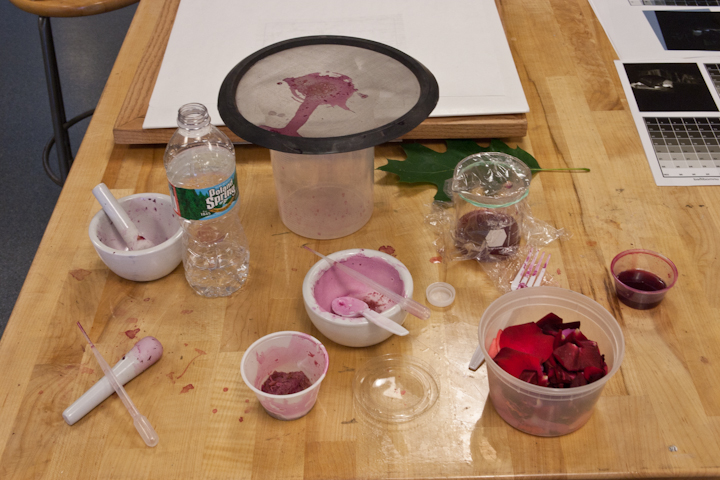
The anthotype emulsion, for what ever reason, is very sensitive to the paper it is applied to. The color changes in response to pH and, because the color you start out with is the color you end up with, coating issues related to internal sizing of paper are magnified. Two papers that I have tried, Utrecht drawing and the washi paper from Kochi didn't have enough size which created a problem with applying the emulsion evenly. It would soak through the paper before it could be spread out. Noticing that spilled emulsion would dry down beautifully on plastic spoons and varnished table surfaces, I decided to try something the exact opposite of an unsized paper, Yupo. This polystyrene sheet absorbs nothing. You are basically pushing around a liquid until it dries. I was hoping it would dry dark like the spilled emulsion or the emulsion left on containers and spoons.

The Yupo was extremely frustrating. It separated the larger pieces of rose pigment that had made it through the coarse filter from the liquid creating a speckled look. Where there was lots of homogenous liquid, it appeared uneven and lighter than I had hoped.

Frustrated with my attempts to let gravity pull the liquid over the surface of the Yupo, I went back to my dorm for dinner. I came back about two hours later to a lovely surprise. The emulsion had dried down darker. While it is still uneven and speckled, I am happy with the degree of color and will try once more with the Yupo, filtering the liquid through a finer mesh and perhaps applying the emulsion with a spray bottle.

A bit boring but a wonderful discovery to come back to after a day of limited success. It reminds me of the story of Marie and Pierre Curie returning to their lab at night following dinner to witness the beautiful glowing color of  the room (from their research into radiation).

Tuesday, July 5, 2011

Gleaners of the Rose Garden


Yesterday, I had the opportunity to work with our student assistant at Emmanuel College, Lauren Nauman. She has been working primarily with the 3-D artists of the residency, Drew Ippoliti and Darien Johnson, so today I wanted to get her out of the studio. We ended up going to the rose garden in the fens behind the Museum of Art. A bit hot to be gleaning rose petals at 12 noon, so we only spent 15 minutes there collecting what we could.

Even though I brought the camera to the rose garden, I neglected to take pictures. Blame it on the heat. In the future I will be sure to get documentation of myself or Lauren in the act of gleaning.

Returning to the studio, we began separating the freshest petals, the ones with the highest moisture content, from those a bit too dried out. Half the petals are getting the freezer treatment to break them up and create the emulsion; the other half we went about grinding up with tap water and our mortar and pestles.

Monday, July 4, 2011

South West not South


The long term projects here at Emmanuel are the anthotypes. Each one will take about 3-4 weeks to expose which may be overkill. They are photograms so I am primarily going to gauge progress by the bleaching away of the ground by the sun. Without the benefit of a compass I estimated the windows were south facing. Going by google maps and the satellite images, I would guess that they are more southwest facing. Why is this even important? The anthotypes are getting a lot more exposure than is possible in my tree covered backyard in Dayton (pang of homesickness felt). This morning I got to the studio a little earlier than my usual twelve noon and noticed that the sun had not yet begun to strike the windows at 9:30 am. I went back later, closer to 11am and it looked like a good bit of sun was now on all three windows. So here is where it is important, I estimate from early evening observations that each anthotype is getting about 7 hours of exposure a day. It's now about 2 pm here and the sun is almost directly in front of the windows. Clouds and cloudy days do complicate things but I think the first anthotype may be ready to pull by the end of next week. I still haven't decided whether I want to introduce movement into the pieces. More on that later.

Friday, July 1, 2011

Two Windows on the World


Danger looms ahead. My sleepwear project has descended to the level of cuteness and smallness. Children’s pajamas. Once I begin using onesies, I risk becoming the Anne Geddes of the alternative photography world. But not yet.

The unaltered pajama on top of the iris coated kozo paper


Today’s trip through the thrift store revealed a summary of consumer pop culture. Transformers, Tony the Tiger, Barbie, various Nickelodeon programs, Thomas the Train, Ariel the Mermaid as Ariel the Princess. I really don’t want to go down that road with this project. It is a little too locked into the late twentieth and early twenty first century.

pajama cut into a single layer on top of the coated paper


Two windows today, the world tomorrow. There are three of these south facing 40″ x 40″ windows on the fifth floor. Now two are occupied with anthotypes. The act of photographing and making photographs always has had a public spectacle component. A public exhibition of process.


The second anthotype waiting for some direct sunlight.

Afterwards, on the way to a late lunch (lunner), I walked past the Harvard School of Medicine Research Building along Louis Pasteur Avenue. I spotted a young woman photographing two of her friends pointing to signage on the glass windows near the entrance. I had to look. I had to see what she was photographing and how she adjusted her height to achieve the desired frame. I paid attention to the symmetrical finger gestures of her friends and their “tourists of the biomedical research world” smiles. I had to look. The act of every photograph being taken is a spectacle.