Tuesday, November 5, 2013

B.G.F.G.A.

News from Ohio Art League's Annual Fall Juried Exhibition. 

Both Bridgette Bogle and I have work in this show. Her collection of paintings, "Twelve Little Mistakes", won a second place juror's (Melissa Vogely-Woods) award. Even with the strong showing of painting, three of the anthotypes were juried into the exhibition. One of them or maybe the three together garnered a "Bad Girls for Good Art" award. 

The exhibition runs  from October 21–December 6. The Fort Hayes Shot Tower Gallery's schedule: 8 am - 4 pm Monday through Friday with the exception of Wednesday. The gallery remains open until 6 pm on Wednesday. 

A closing reception is planned for December 6 5:30-7:30pm.


Tuesday, October 29, 2013

Complimentary Colors

Tonight, I start a long, difficult process of actively using this blog and its mirror site as a means of communicating my artistic practice. It’s been a busy couple of months.

Not just teaching. The anthotypes are maturing in approach and content. I am getting influenced by the painter in my life and other painters in my life. I think all the rubbings on the Vermont pieces were influenced by Bridgette and I viewing the Gerhardt Richter video. Somewht related, when someone mentions complimentary colors to you in a hallway based upon seeing an instagram picture of a work in progress…I better take heed. Rebecca Sargent, thank you.

Exhbition news minus pictures.

The Ino Town, Japan show ended last week. The platinum palladium prints on the Tosa Washi may travel to Kyoto. Stay tuned.

Three anthotypes are on view in Columbus as part of the Ohio Art League Fall Juried Show.

Three anthotypes are on view in Fixed Shadow at Wright State University.

One anthotype (the double exposure one) will be on display in the Soho Photo Gallery Alternative Photography competition.

I will upload pictures of the work, possibly even exhibition documentation in the next few weeks. In the meantime, how about an early image of a work in progress? Complimentary Clot in Saffron, photographed October 21st. 

Monday, September 9, 2013

take note

Camera phones present a useful way to take notes of work in progress. They are certainly helpful with a complicated photographic experiment like mixing plant pigments on top of each other. 

I forgot the order I applied tulip and rose pigments to one of the anthotypes I made in Vermont. I forgot until I discovered this progression of images on the phone.


Iris on top left to right. Red rose on the bottom.


A couple of days later I had settled on creating a four square ground by applying purple iris on top of the red rose (bottom right). The top left is red rose over purple iris. All grids should have received the same number of layers. 

Monday, August 12, 2013

Open Door Policy


Here in Johnson, Vermont I had grand aspirations for a couple of projects. With just a few days left in the residency it seems to have been one project involving Anthotypes. Through it all, whether it was working with and saying good-bye to the July artists in residence to the current August artists, I've kept my door open. 

There has been a lot of work done, much of it mortar and pestle drudgery. Perhaps that's one reason for the open studio. It's so much more interesting to grind plant matter when you have something to listen to or to talk about with visitors.

Here's a list to that I hope to write about as time frees up:

1.     Content of the newest anthotypes: the mix of male and female sleepwear
2.     The studio practice: 12 hours a day in Vermont (sometimes)
3.     Slow to make fast to expose: contrasty juniper leaves
4.     The show in Japan
5.     The Ohio State Fair
6.     Future ideas for the anthotypes / accelerating the fade
7.     Condensation in "tarping up" the anthos

Above is a picture of the favorite antho produced so far in Vermont. "Iris Peignoir with Hidden Boxers"


Thursday, July 25, 2013

summer ball rolling

The last few weeks have been busy. Printing work for a show in Japan. Discovering that I was going to a residency in Vermont...last minute...due to my teaching schedule and the other Ohio artist being unavailable to take advantage of an Ohio Arts Council funded residency at Vermont Studio Center. Packing the car for less than a month of residency here in northern Vermont.

It was a two day drive and now it's two days into the residency. I did dive into work once I got here. Anthotype work. Now two are outside and a third will join them tomorrow morning.

In a previous life I was a monk sequestered in a solitary cell. Maybe I was a lonely groundhog. That's my studio practice. Twelve hour days with breaks for meals and artist talks in between. A walk here. A talk there. Tonight's lecture was by environmental artist Jackie Brookner who's work is concerned with the misperception of water as an unlimited resource.

To get the mid-summer ball rolling, here's a pic from tonight's walk near Johnson Community College.


Wednesday, July 17, 2013

Working with Tosa Washi

How to work with Tosa Washi sans illustrations

Finally there is a sign of progress in regards to printing on Tosa Washi. I completely revamped my approach to making negatives by designing a QTR printer profile. Despite the recent push to use matte black ink for inkjet negatives, I have stuck with the glossy black strictly because of the expense of swapping out black ink on the Epson 4800. It seems to block plenty of UV. The dried down prints show no sign of a change in Dmax in the ground which can accompany the dark ground where the edge of the transparency lies. 

Here's a brief workflow for handling the paper, without illustrations. At some point I will include an entry with pictures but I am short on time which will make sense in a couple of days.

Coating 30 gsm Tosa Washi

1. I use a 3 inch wide synthetic bristle brush, which gets primed with distilled water prior to coating. I run the brush against the sides of the distilled water dish to discharge as much of the distilled water as possible.

2. The paper is placed on a piece of felt. I am using an 11 x 14 inch size piece for paper that is about 9" x 12". I use two strips of poplar weighted down with a stainless steel straight edge and a large wrench. These go to the left and right edges of the paper to keep it from moving during coating. I coat on the smooth side of the paper.
3. I brush initially in one direction from left to right, dipping the brush into the palladium / ferric oxalate mix for each pass. After creating four rows, I build up emulsion on the right side by starting at the bottom and brushing in one direction upwards. The action of the brushing goes from fast to slow. Fast at the start of a row or column and slower as you get to the other side. I use about 80 drop total for the 9" x 12" size paper.

4. I hang the paper on a clothesline, allowing it to air dry for thirty minutes.
Print Frame and exposure.

5. I lay a sheet of card stock weight paper on the felt of spring back of the print frame.

6. Next comes the coated sheet emulsion up.

7. I use a sheet of clear mylar  as a barrier between the negative and the coated paper. The paper has a lot of emulsion on it.

8. The negative is placed upon the mylar and the split back is assemble together.

Exposure:
9. Exposures have been running around 60 minutes to 90 minutes in a BL fluorescent exposure unit. I do use a Stouffer's step tablet and expose to just barely make out the distinction between step 7 and 8.

10. It is very hard to gauge exposure so I recommend smaller coated pieces of paper as test strips. 

Development and clearing:

11. I use a piece of Plexiglass that is slightly smaller than the tray but larger than the print to transport it between trays. 

12. Always, always, always have chemistry in the tray before placing the print into the tray. The only modification to this is developer. I place the print into a tray with the Plexiglass with 80 percent of the developer. Once the paper has absorbed the developer from the reverse side, I pour the remaining developer onto the surface.

13. The paper is strong but prone to damage towards the end of clearing. I place the plexi and print into a slightly tilted tray with running water. The water strikes the tray in the upper left corner and monitor the print for five minutes taking care that the print does not roll up on itself or travel underneath the running water. 

14. The washed print is transported on the plexiglass to a table. I place a piece of blotter paper on top and lightly brayer the blotter paper. I then peel off the print from the Plexiglass and transfer it to a clean drying screen.

The prints have a bit of texture from the drying process and will need to be smoothed out with a clothes iron or dry mount press. Experiment with overexposed / underexposed prints.


Tuesday, July 2, 2013

daunting task(s)

There lies in front of me a daunting task. Within this lies many little, yet no less daunting, tasks. This challenge is printing historical process photographs on a new paper that is whisper thin. Thirty grams per square meter thin Tosa Washi made specifically for a show in Inno Town, Japan.

 I have investigated dosa as a well to make the paper respond well to various emulsions yet just as I was experiencing success, I read about the archival (acidic) issues with this method. After watching a video by the master platinum printer Nishimaru san who created this paper, I accepted the challenge of working with this paper as it is.

Several things that he has incorporated into his process have obvious advantages. The bamboo rod he uses to transport the paper from tray to tray. I am opting for a sheet of clear acrylic but would love to try this at some point. I have access to bamboo skewers in the kitchen.

Charging of the brush with distilled water is one of the most sensible things I have done. This prevents the brush from soaking up all the chemistry before it can be applied to a very thirsty paper. So glad I did this right away instead of wasting paper and chemistry with a dry brush. It could have been an expensive "DERP!" moment.  I will have to stock more distilled water in the work area.

Perhaps the most amazing thing I discovered from the video was the use of felt underneath the paper. This prevents the paper from creasing as brush pressure is applied to the surface of the washi. It also creates a bit of friction with two pieces of poplar at the left and right edges so that the paper stays put.

Although the paper is designed to be used with the traditional platinum and palladium printing process, I have decided to try a Ziatype emulsion on it. Zia is a less expensive way of using palladium to form an image and it prints out an image. That means less calculation to determine proper exposure and no developer which means one less tray for a paper that is very prone to tearing and fraying in water. I also have a bit of Ziatype chemistry left over from a previous project.

Below is my text target from which I will generate a curve for the Ziatype on this the Tosa Washi. I will still create palladium prints on this paper. That is Plan A. The Ziatype will be Plan B in case I am running low on Palladium chemistry and a very finite supply of paper.


Friday, June 28, 2013

sleepwear 2.0 with chiffon

A few days ago I was thinking about the sleepwear anthotypes. Thinking about how they are rather uncomplicated. Basic photograms done with plant pigments. This probably stemmed from one of the onionskin anthotypes I did this winter. While it succeeded, it also seemed like it was one note. It was too simple and the single layer of pajama top I used didn't immediately read "sleepwear".

Last summer, Bridgette was asking provocative questions as she is apt to do. One of these questions related to the layering of color. One on top of the other. I was initially convinced that the water content of the successive layer would wash away the anthotype exposure underneath much like invasive rain water had done to a couple of anthos.

A few weeks ago I was actually layering beet root juice (from a can) on top of existing onionskin and it didn't have an effect on the layer below. Both remained distinct which led me to the idea of layering exposures one on top of the other.

Here's a couple of images to illustrate where this is heading. I am heading towards anthotypes 2.0 which involves the layering of his and her sleepwear in the final anthotype.

Below is the aforementioned onionskin anthotype with one layer of rose petal emulsion on top.


Below is the same anthotype with three layers of red rose petal emulsion. The light resist is a bed jacket donated by Kristi Bogle which has a connection to the Roswell museum of art.


Tuesday, June 25, 2013

never show one's failures

I am sure that there is some rule out there that for purposes of professionalism, one does not show one's failures. 
Below is one such failure. I had decided to employ stretch wrap as a water barrier in addition to the 3 panels of clear acrylic. Never again with the stretch wrap. Photo courtesy of Christina Zuercher.

Below is attempt number two. This time with a different pajama set and with red rose emulsion. I still am struggling with composition with the men's pajamas. They are so ...static. 

Saturday, June 8, 2013

note from an ephemeral photographer who happens to also make ephemeral things

Note from an ephemeral photographer who happens to also make ephemeral things. I wrote that as I began an attraction and repulsion to SnapChat but on to  anthotype matters.

I am not terribly enthused by this pajama anthotype (arrangement and pattern) which means it just might surprise me in a couple of weeks. You can look at the arrangement from yesterday's entry. Here is a detail of the pajama's textile pattern.


Friday, June 7, 2013

Summer pajamas in iris day 1


Today doesn't really count (as day one). I have had this sheet of  59" x 46" coated water color paper waiting for a couple of things to occur. The first item was getting a sheet of OSB cut down to accommodate the paper. I got around to that late last week. Forty-six inches happens to be the widest sheet the Subaru Forester will accommodate.

The second hold-up: I was planning on using another peignoir but decided that if I was going to continue to use pajamas in this series that the added opacity of men's sleepwear would be best served by exposing the anthotypes as close to the summer solstice as possible. 

Today's mail produced a vintage set of Sears summer pjs. 

The third obstacle actually has a fourth obstacle associated with it. Working this scale means either buying a sheet of plexiglass or scavaging the garage for an alternative. Since a new sheet of plex would be around seventy dollars, I opted for the latter. I ended up cutting down three scraps that when pieced together would cover up the paper and pajamas. That was today. 


Last Saturday I attended a presentation on proper techniques for packing art work for shipping. It was during that session that I was introduced to plastic cling wrap. This is what I ended up using (along with a small amount of packing tape) to secure the three separate pieces of plex, hopefully creating a water barrier in the process.


Tomorrow will be officially day one.

Thursday, May 30, 2013

Red Tulip part II

The two red tulip anthotypes were exposed for about the same amount of time. I estimate about nine days give or take a rain day. 

If you look at the lower right corner you can see rain did make its presence known despite wrapping the "contraption" in plastic. The contraption is usually a thin sheet of OSB, the paper coated with pigment, the garment, and Plexiglass all held together by spring clamps. The spring clamps show up occasionally around the periphery of the finished anthotype. Bridgette has described them as giving the finished piece a rhythm. I use to hate the artifacts they left behind, now I am kind of digging them. 

This anthotype was made with the same emulsion as the "Little Gown" anthotype but I kept the red tulip color by adding a bit of citric acid to the emulsion. Normally this paper (Arches Cover) and Fabriano Artistico have a bit of buffer that pushes the color to the blue end of the spectrum. Flower pigments act as a pH indicator for naturalists. I have even made purple iris pigment red. 


This is "Red Tulip (acidic) Peignoir #1". 51" (H) x 42" (w).

Speaking of iris pigment. I raided the last ones today. I have a bit frozen away and two sheets already coated one of which is exposing right now. I see plenty of purple gowns, peignoirs and pajamas in the future.


Wednesday, May 29, 2013

Red Tulip (Basic) Little Gown

The weeks around the summer solstice are amazing times for this anthotypist who is so used to slow emulsions and winter sunlight in the midwest.

I removed the two red tulip anthotypes today and the results were more than I could have hoped for. Today I am uploading one I will be giving the clumsy title of Red Tulip (Basic) Little Gown. It is arguably the better of the two primarily for the delicate lines around the sleeve and neck areas.

Yes, it is blue even though it has "red" in the title due to the buffering in the paper which has shifted the color towards a cooler tint. The dimensions for this anthotype are 36" x 26".


Tuesday, May 28, 2013

Photography's Back to the Future Review in the Columbus Dispatch

The survey of Ohio photography at the Riffe Gallery in Columbus, Photography's Back to the Future curated by Catherine Evans, has been reviewed by Melissa Starker in the Sunday, May 26th 2013 edition of the Columbus Dispatch. Don't Take This Personally is shown (print version only) and described in detail at the beginning of the review starting at the third paragraph!

Monday, May 27, 2013

Vandyke Brown on Washi Workshop

Vandyke Brown on Japanese Paper Workshop

hand_brush-1
I realize that summer is right around the corner and for many of you plans for the next three months are already set.  If you are still looking for an alternative photography workshop this summer please consider …
2013 Vandyke Brown Print on Japanese Paper Workshop with Francis Schanberger
Level: Beginner through Advanced
Location: South Park Historical District, Dayton, Ohio
When:
  • 2-day workshop July 19th  2013
  • Friday, 9:00 am – 6:00 pm
  • Saturday, 9:00 am – 6:00 pm
Cost: $375 per person plus $95 materials fee (for paper and gold toner). Reservations are on a first-come first-serve basis by email with a deposit of $200 through PayPal. Partial refunds will be given if your reservation is canceled no less than 21 days before the workshop is scheduled to be held and will be subject to a to a PayPal service fee.
Limited to 6 students.
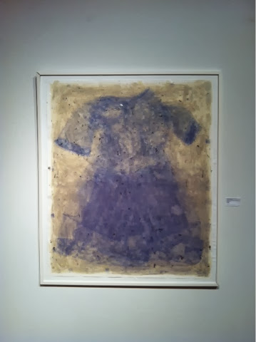
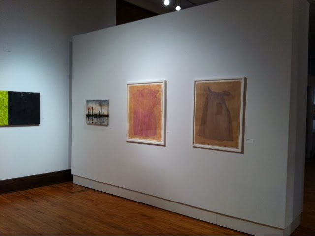
About the Process: The Vandyke Brown Print is part of the Kallitype (Iron Salt based) family of photographic processes. It stands out due to its unique printing out of an image that requires no developing agent.  Vandyke Brown prints work on many papers but can create difficulties due to the amount of chemistry that gets absorbed by the paper. Careful consideration of how papers are sized and even applying a surface size can result in spectacular prints. Additionally, deep rich chocolate browns can be achieved through control of humidity and toning with precious metals like gold and palladium. An archival print is achieved by thoroughly fixing and washing out hypo, and iron, combined with toning.
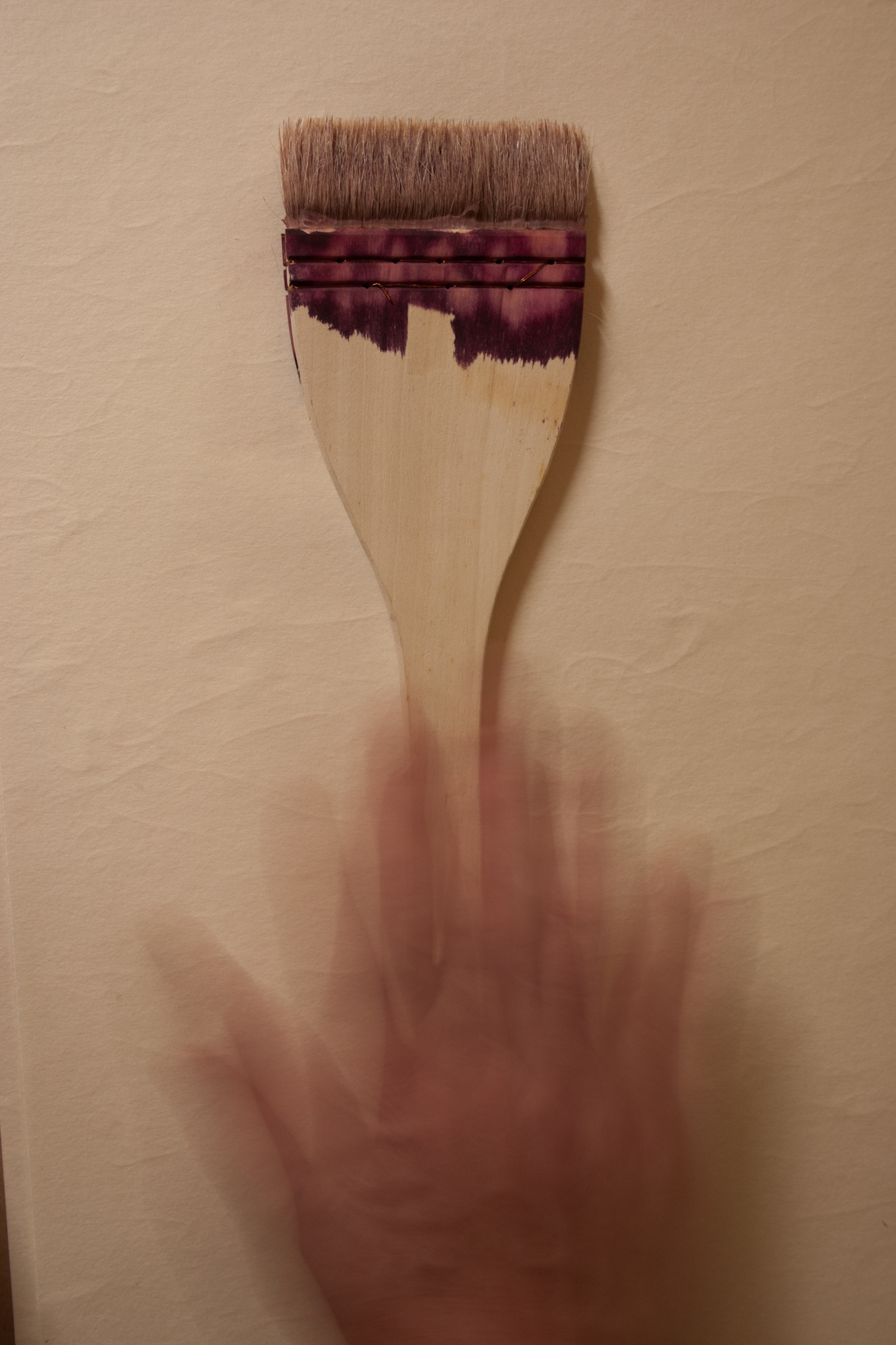
Workshop Agenda: In this intensive 2-day workshop, students will create several inkjet negatives for use with specific Japanese papers. Each student will learn how to deal with the challenges of coating and processing Vandyke Brown on three different washi papers. This workshop will also include a demonstration of sizing paper using the Japanese method of applying dosa, which can significantly expand the number of papers onto which photographers can print. Additionally, students will learn how to archivally process their prints as well as have the opportunity to tone their favorite prints from the workshop.
Bio: Francis Schanberger is an Ohio based artist originally from San Diego, California. He first became acquainted with historical photographic processes through the workshops organized by the Museum of Photographic Arts and Grossmont Community College. His current work involves the extensive use of the Vandyke Brown Print on Japanese handmade papers (washi). These images are sometimes collectively pieced together to greatly increase the scale of work and highlight the unique qualities of washi. In the fall of 2013, Francis will be one of two American and three Japanese artists to exhibit photographs at the Japanese Paper Museum in Ino, Japan using a tosa washi paper made specifically for alternative processes by traditional paper craftsmen. His Vandyke Brown work was recently published in Christine Anderson’s Gum Printing and Other Amazing Contact Printing Processes and is featured in Christopher James’ Book of Alternative Photographic Processes. Last year his anthotype prints were published in Malin Fabbi’s Anthotypes: Explore the Darkroom in Your Garden.
Dayton: Dayton once relied extensively on manufacturing as part of its economic base. It is located in America’s rustbelt and represents one of the major metropolitan areas in Ohio. Dayton’s connection with aviation history and the abandoned manufacturing areas create opportunities for photographers unique to this part of the country. It is also the historical home of Jane Reece, one of the key pictorialist photographers outside of Alfred Stieglitz’ circle of artists.
Transportation: South Park Historical District is located near downtown Dayton and is about 21 minutes from Dayton International Airport. A cab ride should cost about $40.
Accommodations: There are Bed and Breakfast Inns located in the neighboring Oregon District such as Inn Port D’Vino as well as major hotels such as Marriott along the river.
Contact: Francis Schanberger, email: frangst@gmail.com, tel. 614.282.9871
Website: www.frangst.com

Saturday, May 25, 2013

a new drawing board


At some point last week, maybe it was Friday the 17th, the new paper from Ino Town, Japan arrived. It's extremely lightweight and extremely challenging on every front. 

Here are some notes collected so they won't get lost.

The paper is about 30 gsm which is about 60 percent of the lightest paper onto which have ever printed.

It needs to be sized for Vandyke Brown. It probably works for iron based processes with a coating rod. For silver / iron processes the silver will accumulate and plate out.

I've taught myself how to work with Dosa (basically rabbit skin glue and alum). This paper does OK with  just one coat on each side but will probably be awesome with two coats per side. 

I will probably use the Dosa technique on the Kozo Unryu to solve the pinhole issue.

The paper will require a new curve. An initial print done with a Kozo Unryu negative looked posterized.

Did I mention that the paper is extremely thin? The extensive washing needed for VDB was a bit rough on my first attempt. I managed to not destroy the second attempt but will have to screen dry all of the prints. 

So far I have printed an 11x 14 inch size print. It is going to be a real challenge to print the 23 x 18 inch size images I proposed to the museum.


Tuesday, May 21, 2013

red state, blue state


The other anthotype involves the use of a nightgown purchased off eBay from a woman living in Alabama. This anthotype also invokes the red tulip emulsion but you may notice it looks a bit like cornflower blue. I noticed in 2011 when I had access to the rose garden in Boston that a red rose emulsion would be shifted towards blue. I speculated that it was the buffering in the paper or perhaps as the emulsion oxidized it became more alkaline.

The one thing that supports this idea is the addition of citric acid to the emulsion. Instead of heading towards blue, the acidified emulsion stays red. The large peignoir antho was prepared this way. The little green nightgown was not. BTW, both show significant fading as of Tuesday and they only went out on Sunday.

Regarding the little green nightgown, there was a Post-it note included with the  garment. It read: "Please take care of this little dress. She's been in our family for sixty years."

I am not going to reveal to the seller that I am leaving it out in sunlight for days upon days but I might mail her a snap of the finished anthotype. 


Sunday, May 19, 2013

sheer sheerness of it all

To begin with some disclaimer, I am not entirely sure how I ended up here. I know there was never some end goal to work with lingerie. I do feel like the sheer sheerness of it all is promising to create some intriguing anthotypes for the Somnambulist project.

This is an extension of the sleepwear. Two, maybe two and one half, years ago I began using pajamas as a light resist. The reason was a memory of my father when he was in the hospital sometime in 2004 wearing pajamas, which brought up a childhood memory of seeing him late at night in pajamas in his rocking chair, cocktail in hand and my mom lying on the sofa. Both of them watching the Tonight Show with Johnny Carson. It was their time. We, the brood, all nine of us, were supposed to be in bed. It was the parents time to unwind.

So here I am at nightgowns and peignoirs, a word I only just learned. The trajectory has been this: pajamas, Ken pajamas, Barbie Nightie Negligee, nightgowns (plural) and now peignoirs. The success (exposure-wise) of the Barbie Nightie Negligee probably sowed the seeds of my destruction. An Ebay search for mid-century women's sleepwear.

To spread out the documentation I'll just include images of the assembly of the peignoir anthotype. Tomorrow I'll post about the nightgown, a sixty year-old nightgown. The discoveries of this project so far:

  • I need to do a better job organizing my spring clamps (there must be a second stash somewhere).
  • I need to acquire more large, clear plastic bags to weatherize the anthotypes.
  • I need even more Plexiglass.
  • I am in touch with my feminine side.
  • The first arrangements of each light resists are usually the best. Please see the illustrations(s) below. 


Saturday, May 18, 2013

a medium for the young

 Grinding up flower petals into pigment (actually an aqueous emulsion) is time consuming and feels like its backbreaking. It's more like back aching. Hence it is a photographic medium for the young if they have the patience. 

I've been stuck working on the red tulips since I gathered them last week and tried to combine them with an under painting (yes, I borrowed a painting term) of beets (from a can). I suspect the salt in the canned beets is the heart of the lighting problem. I will test this out later in the summer once other projects get completed. 

While I was wrestling with the beet / tulip mix I began coating two separate sheets of paper, one Fabriano Artistico hot press and the other Arches Cover.

Each has gotten about 5 coats of red tulip emulsion. Besides the paper difference, I also acidified the tulip emulsion for the larger (Arches Cover) sheet which is what the image below is showing. It is a bit streaky and it has been difficult handling a 50" x 42" sheet  of paper. I've been coating it outside and transporting it back to the garage to dry. 

There is also a bit of debris (think sediment) in the coating. I resorted to an alcohol water mix at the end to pull out enough pigment to cover both sheets with several coats. This usually shows up when using Everclear to pull pigment from flower petals. 

Maybe tomorrow I will get to assembling the anthotype for exposure. I still have to cut a sheet of plex to fit the backing board and create a water tight covering for the whole thing in case I can rescue it from a downpour.

Tomorrow I will reveal what the tulip anthotype is going to be. There actually should be two going out.  I am moving on to women's sleepwear for most of this summer's anthotypes. There goes any art cred I may have had.