Thursday, April 28, 2011

Me, Monarch self-portrait exhibition


Me, Monarch is up for view in the Ravi Photo Gallery, Hyderabad, INDIA. This is an exhibition of self-portraits done with pinhole cameras by 98 photographers from around the globe (24 countries).  


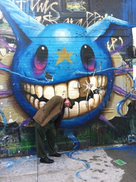
Even though I already posted the Dr. Frangst and Catkins (in zone plate), I wanted to include this detail which is the process of being printed as this cropped version. Yes, it's my current facebook profile picture. That's how much I am in love with it. If it wasn't obvious before, there should be no doubt regarding my narcissistic tendencies. 


Wednesday, April 27, 2011

registering an image

We had a brief lull in the rain here in southwest Ohio and I put the pokeberry print (Clem Wolfham) out for a little more exposure.

But wait, there's more.

I also put out one of the purple petal Anthotypes, actually looking like cornflower blue, using a positive transparency which is detail of a bathrobe with the name Mel Miller. I had it out in mixed lighting conditions, mostly cloudy, for about 3 hours.

I brought them back in after about 2 1/2 hours (I had to teach and early evening class) opened the split back printing frame and saw that it already had registered an image.

IT'S WORKING!


I'll post a couple of images later tonight.

And yes, I spent about an hour picking more purple flowers out of fear they won't be around much longer.

Tomorrow I am installing the Flowers from a Cigar Tree print in Columbus which is part of the Ohio Art League's 100th anniversary Spring Juried Exhibition. The work to be shown in the Carnegie Gallery of the Columbus Metropolitan Library (main branch) was selected by OSU Sculpture professor Todd Slaughter.

I do think tomorrow will be a Dirty Franks kind of day. Anyone want to meet up for a hotdog?

Thursday, April 21, 2011

paper matters


The one variable that strikes fear into the hearts of those of us working with hand applied, light sensitive emulsions: paper types and paper pH. With a delicate, hard to harvest and distill emulsion like the purple flowers I am discovering that paper matters.

I've been noticing that the flower petal emulsion seems a bit faint and much bluer than I expected. I've come across references to flower pigments yielding surprise colors with no reason. I suspect that the pH of the paper is the culprit.

The picture above has four paper types.


  1. The paper on the bottom is the Fabriano Aritstico Hot Press Extra White. It worked great for the Pokeberry juice but the emulsion seems faint when brushing on. I ended up putting three coats on it and got what Bridgette thinks is a nice blue. Thanks Bridgette and Jill for the suggestion.
  2. The next paper is a light weight Kozo paper from Bostick and Sullivan. It was labeled E on their old sampler pack which was a freebie a few years back!
  3. On top of that is a square of Arches Platine, a favorite paper of platinum palladium printers.
  4. On top of everything is a strip of my favorite Kozo Unryu (the backside). Surprise... it looks the best!


BTW, the happy accident also contributed to this report. I was using the Kozo Unryu as a means of wiping off the organic debris from my brush and noticed that it looked purple and the purple seemed stronger than the blue that was applied in one coat to the Fabriano. I don't know the pH of the Kozo Unryu but I do know the Kozo light weight and Arches Platine work well with iron (siderotype) processes because of their neutral to slightly acidic pH.

I remember from undergraduate biochemistry the role of pH on the 3-D structure of proteins. During the last few weeks  also discovered that heating plant pigments to "reduce" them is not a good idea. I lost the rich magenta color of pokeberrry doing this very thing. Changing the shape of the protein via heat  or pH may change its color.


Tuesday, April 19, 2011

and the paper smells like root beer


The pokeberry anthotype of Clem's pajama top (small version) is close to being done. Here is a scan from Sunday afternoon. 

Pokeberry juice has spoiled me. It provided a strong tincture to use. Now I am struggling to get these small violet flowers to have a presence on a sheet of paper. I managed to get about 50-75 cc of tincture but it seems too dilute and the root beer flavored vodka I used as a solvent has created some new concerns. The sugar in the alcohol has created a stickiness to the emulsion. So the update: the new purple flowers have yielded a sticky and weak liquid that really reads blue and the paper smells like root beer.

strategies: 
  1. Maybe I can do multiple passes to build up density (suggested by Bridgette). 
  2. Let the emulsion evaporate over several days without heating to create a reduction that is denser with pigment.
  3. Throw in the towel.


Sunday, April 17, 2011

my color purple handiwork, part I

These are the beginnings of my attempt to continue the sleepwear sleepwere sleepwhere series (the title is morphing). The first test at making an anthotype emulsion from the small purple flowers yielded a dilute, blue liquid. Friday I hunched over and picked about 260 grams of flowers off which I have been stripping the petals this weekend.


 halfway through the bag on Sunday

I've gone through the bag, frozen the petals, thawed them out, crushed them down a bit and now they are re-freezing. Tomorrow I should have a nice slurry to add ethanol to pull the pigment out which I will filter and hopefully have enough to coat some large pieces of watercolor paper. At least one big enough to lay a polyester sleep robe with a paisley pattern on it. Now I really do need to look at the work of Jim Dine.

stripped, frozen, and crushed

Saturday, April 16, 2011

dr. frangst video from 2005

This was a video interview with Annegreth Nill talking about my work in July 2005, part of the Made in Ohio exhibit at the Riffe gallery.


Here is the link:


http://www.ohiochannel.org/medialibrary/Media.aspx?fileId=129354&returnTo=Collection

Thursday, April 14, 2011

the color purple


If there is one good thing about letting the wild reclaim the backyard (to a degree) is that I don't have to go very far for potential pigments for anthotype.

Today I successfully mashed up and pulled out the pigment from these small purple flowers sprouting all over the front and backyards. I collected about twenty flowers, stripped off the petals and immersed them in Mr. Boston rum. Not seeing any color migrate to the alcohol, I poured the mix into my mortar and pestle (the darkroom one, not the kitchen's) and worked it until I had a purplish heterogeneous mixture. Pictures tomorrow. In the next few days I am going to harvest all of the purple flowers and place them in tubs with a bit of water and let the wonders of freeze/thaw fracture work its wonders in (and out of) our basement freezer. 

The next anthotypes will be the color purple.


Wednesday, April 13, 2011

handwriting as a trace


In a few weeks maybe even in the next few days I will need to come up with an alternate to the pokeberry juice with which I have begun my initial work in anthotype. This is the last sheet (about 9" x 12" or 22 cm 30 cm) and it is dedicated to Clem and the writing around the collar of his pajama top.

My hope is that most of the sleeping anthotypes will be done in pokeberry or indigenous Ohio plant pigments as photograms. This smaller piece will be one of a few additions to the project which will be from an inkjet transparency. The pajama was scanned and made into a positive transparency. Perhaps this starts a structure for the project, photogram and scanned transparency images paired with each other and contributing different information, this latest one is more about text and handwritten language as a trace.

What follows are the records of the days I put the piece out with the exception of one afternoon not represented by an image.


April 1


April 3


April 5


April 6


April 7

There was an afternoon exposure sometime around April 8 or April 9


April 10


April 13


Sunday, April 10, 2011

a little return of the return of dr. frangst

Searching my archives for a negative I never included in the Dr. Frangst series, I found this zoneplate image from 2004-2005.

I may print this yet in its cropped version. Did you know that Photoshop CS 5 has a Rule of Thirds grid for the cropping tool?


Friday, April 8, 2011

when a cigar tree is not a cigar tree


"Flowers from a Cigar Tree" will be included in the Ohio Art League Gallery's 100th Spring Juried Exhibition (juror Todd Slaughter). That means map pins, vandyke brown segments of a larger image and myself will be at the Main Columbus Library sometime in the next two weeks for the installation.


Dates for the exhibition are May 6 - June 24, 2011. An opening reception is scheduled for  Thursday, May 12, 6 - 8 p.m. in the Carnegie Gallery (2nd Floor).

Thursday, March 31, 2011

gallery sightings: photo emulsion on handmade paper

The question is, if this blog is about the goings on in my studio (not very much as of March 30th) then why write about a trip to New York city? 


Note taking and note keeping. Unless I put this down in written form, I am going to forget what I saw.


Just a quick stab at recollection. Last Thursday, Bridgette, Jill Scheibler and I walked around a few blocks around 24th street and 10th avenue. In order alleviate some guilt on their part regarding all the painting and sculpture we were looking at, they agreed to go to a few photography venues. Aperture was the big one, where we got to see them lighting Jungjin Lee's  "Wind" exhibition. These were all done on handmade Korean mulberry paper. Later that night we returned with a few extra friends to experience a big Chelsea Thursday evening art opening. 


The next day I walked up Avenue of the Americas with Tim Castlen photographing along the way. Our primary destination was ICP and the Mexican Suitcase exhibit. I'll save a discussion of that for another time. After ICP we continue on up what may have been Broadway until we reached 57th street. I had steered us this way because of the cluster of midtown art galleries, hoping that we would get to Pace MacGill. We didn't but we did visit two galleries on West 57th, the Robert Anderson Gallery and the Marlborough Gallery. 

At the Robert Anderson gallery there were actually three shows up mostly work by Suzanne Opton and Geoff Winingham but in the back were three large black and white prints framed 30" x 30" by Barbara Mensch.

Jean Pagliuso was showing her Poultry and Raptor Suites of enlarged photo emulsion prints on Kaji and Thai Mulberry papers.

Although two doesn't make a trend, it's interesting to see two very different bodies of work with similar means of print making. It makes me rethink whether I want to show students Liquid Light on wood and metal or whether a beautiful handmade paper will win them over. 

Sunday, March 27, 2011

Narcissus as a man in Chelsea wearing hat and cardigan

Some pictures of my adventures in Chelsea this past weekend. It's been around 8-9 years since I have been to NYC. I had a lot of catching up to do. Photos courtesy of Jill Scheibler.


Saturday, March 26, 2011

two couples

Empire diner in Chelsea has been closed for a while by the looks of it and mannequins are extra, extra frightening at night en masse.

Friday, March 25, 2011

small city mouse in the big city [mostly Chelsea], day one

Bridgette and I are visiting NYC for a few days and trying to absorb as much work as we can. So this is a bit of a photocentric gallery report not in any specific chronological order. Basically we headed down to the galleries beyond 10th avenue in Chelsea looking for Karen Kliminik's installation


and ended up finding a lot of work before and after we stopped in at 303 gallery. The most memorable work for me was the work of Mark Morrisroe at ClampArt. I keep telling my students in alternative photography about the strange reds that James Fee tweeked out of his prints through chemical means. The same orange red was present in many of the chemically abused prints by Morrisroe made in the 1980's. This is due to the fact that older papers made before the mid-90's  had cadmium included in the manufacturing and non-traditional high contrast developers and toners were able to convert the cadmium into cadmium selenide or cadmium sulfide.

http://www.clampart.com/inventory/inventoryimages/imagemorrisroe08.htm

Bridgette and our friend Jill Scheibler loved the painted on and scratched upon inkjet prints of Sarah Anne Johnson's "The Artic Circle" at Julie Saul Gallery.

http://www.saulgallery.com/johnson/statement.html

More tomorrow about chickens and wind pictured on paper coated with photo emulsion.

Monday, March 21, 2011

before and after

March 12th, 2011
March 20th, 2011

Sunday, March 20, 2011

stopping point


After the "unveil" last week I felt the anthotype needed more exposure and more detail in the middle of the object. I cut the pajama top into two layers and use the front of the pajama for the most recent exposure of about 2 1/2 afternoons. Registration is...well...off. That was an accepted part of this final attempt. I am now face with a decision. Do I intentionally move the the subject in future anthotype photograms? Do I keep it in register to maximize sharpness? Do I allow both to occur in the series?

I have a working title for the project of "Fade Away" to refer to the fading action of the sun on the pigment and the passing on of the previous owner of these pajamas and maybe even the fading away of Henry Peach Robinson fame. I'll upload the full PJ anthotype photogram later this week.

Monday, March 14, 2011

[insert winking emoticon here]


In time for your springtime sneezing and wheezing comes word from the O.C. that Forces of Nature is on display.

Here's a link to the press release from the Orange Coast College website. The exhibition runs concurrently with the showing of the platinum printing of Stan Klimek. The PR smacks of precious metal favoritism [insert winking emoticon here].

Closer to home, the link to the Christopher Yates review in the Columbus Dispatch of the Naturalists, curated by Bridgette Bogle, can be located here.

Sunday, March 13, 2011

Sleeping in the Rain


As promised the first of the pajama anthotypes. I need to live with this for a while. My initial response is that it needs more exposure time. Almost needs to be less dense in the middle of the pajama so that it feels more ghostly. Clem's name written in Sharpie isn't visible which was one of my hoped for details. But the two types of rain drips are positive surprise. In the image you can make out a diffuse, elongated white mark in the main part of the image. This is where rain got under the plexiglass but only soaked the garment which in turn wet the paper. The other drip is visible in the shoulder areas. This is where rainwater directly removed pigment from the paper and as Bridgette describes it "very painterly".

I want to build a large frame to make the anthotypes a bit better at resisting water and I do wish for cleaner plexiglass. But for now I have to save up for the residency in Boston this summer.

Saturday, March 12, 2011

Write Up the Write Ups


To be blunt, this weblog is useful for me to keep track of exhibitions and, when they occur, reviews of the exhibitions in which I show work. This is one of those types of entries.

Melissa Starker reviewed "the Naturalists" at the Ohio Art League gallery in last Thursday's edition of the Columbus Alive.

Here's the link to the article on line: http://www.columbusalive.com/live/content/features/stories/2011/03/10/exhibit-the-naturalists-at-ohio-art-league.html?sid=108#

Look in tomorrow's edition of the Columbus Dispatch for Christopher Yates' review of the exhibition.

Friday, March 11, 2011

I really shouldn't be showing this...


Caveat #1: The only Plexiglass big enough for my Anthotype experiment on the cheap was the sheet of acrylic on which I coat the Forces of Nature prints. I thought I cleaned it prior to re-purposing it but the light of day reveals all of the flaws in my plan.

Caveat #2: This became a test or more accurately a run through. What would I be able to make a photograph with from materials lying around? With the exception of the Fabriano Artistico Hot Press roll of paper Bridgette and I went in on together, everything else was at hand: spring clamps from Big Lots, the aforementioned Plexiglass, the pajama top and the pokeberry juice diluted down a bit with water.

Caveat #3: It's about process. The unfading marks (squares) and rainwater drips (from the day we were in Columbus installing the Naturalists) may very well become part of the piece. Seen above, the spots where the spring clamps were at are a good indication of what kind of change has happened.

I estimate that the Anthotype has gotten about 4 1/2 afternoons of exposure. I will leave it out tomorrow for a final bit of sunlight and tomorrow night for better or for worse I will unveil the Anthotype to Bridgette and think about what I need to do next time so that it won't be a run through.

If it looks fabulous I will blog it on Sunday. If it is a mess, I will still post it Sunday. After all, as an artist I acknowledge the possibility of failure.