Showing posts with label sleepwear. Show all posts

Sunday, July 20, 2014

haunted sleepwear

Lately, I have been fixated on vascular support stockings. They trigger a memory of seeing my father wear them. Occasionally I would see his stockings folded after being laundered.  At other times I might would actually see him wearing them because of his pajama shorts he wore close to bed time.

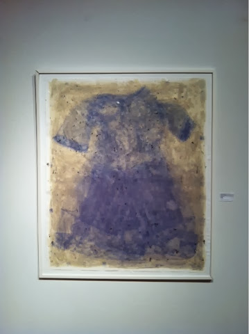
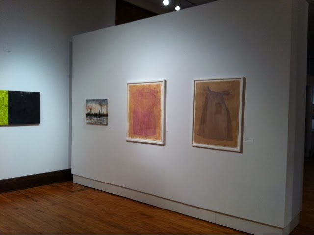
I made the first version of the pajama shorts in February specifically for an exhibition at Proto Gallery in Hoboken, New Jersey. I made two additional versions early this summer. Number two was made with different coats of saffron and rainbow chard. Number one and number three were made with straight chard. Number three will be on display in Columbus starting tomorrow as part of the Fine Arts Exhibition at the Ohio State Fair. The most recent version ditches the pajama shorts in my attempt to create a sleepwear creature. When she saw the finished red tulip anthotype, my wife Bridgette said she was reminded of one of the ghost hitchhikers from Walt Disney's Haunted Mansion. Disney updated a few of their classic attractions in the last 15 years. So if you want to see the connection, look for an older photograph taken at the amusement park. I am including one appropriated from tvbythenumbers.net.

Pajama Shorts with Anti-Embolism Stockings Number One

Pajama Shorts with Anti-Embolism Stockings Number Two

Pajama Shorts with Anti-Embolism Stockings Number Three

Bed Jacket with Anti-Embolism Stockings Number One

Ghost Hitchhikers from Walt Disney's Haunted Mansion

Wednesday, July 2, 2014

Bed Jackets Times Two

It is difficult to know where to start, when I haven't blogged about my making in three months. 

I am currently using red tulip petals collected during early May. Truly gleaned because allof the petals were on the ground. The ones that were too damp, we're cleaned in water and ground up in a mortar and pestle. That first red tulip anthotype of the year was one of two images I've made involving two bed jackets. The exposure was stopped late last month and is a bit more narrative than the first double bad jacket image (made from yellow onion skin). 

Below are both of the images. Top: yellow onionskin "Two Bed Jackets". Bottom image: "Puppet Show" in acidified red tulip.


Monday, January 6, 2014

greetings from the frozen midwest

Staying in today to avoid the wind, the wind-chill and the subzero temperatures. I even emptied my work area in the garage to make a spot for the car. That's what garages are typically designed for...the sheltering of cars, not the coating of anthotypes or UV exposure dependent printing. 

It's a good day for late, late portfolio review follow-ups. I think I sent one about four weeks after getting back from Chicago. That would have been early November. I guess now they are New Year's greetings. 

Next week, the Eight Annual OOVAR (Ohio Online Visual Artist Registry) Exhibition will have a closing reception on Saturday, January 11, 2014 from 2-3:30 p.m. in the Carnegie Gallery which is on the second floor of the Columbus Metropolitan Library's main branch. Included is a digital print of the (Basic) Red Tulip Sleeping Dress

The original was just sold by Loretta Puncer's Gallery 510. It is my favorite of the anthotypes and am glad to see it go to a good home. The framed anthotypes do take up a bit of room in my studio / slash office. I really do take after my father. His office was unusable except for a small area of a table in a room full of stacks of medical journals and old mail. 

No nightmarish pictures of cluttered office spaces today. Instead just a few snaps of the start of the (Basic) Red Tulip Sleeping Dress and it's final framed version.


Tuesday, November 5, 2013

B.G.F.G.A.

News from Ohio Art League's Annual Fall Juried Exhibition. 

Both Bridgette Bogle and I have work in this show. Her collection of paintings, "Twelve Little Mistakes", won a second place juror's (Melissa Vogely-Woods) award. Even with the strong showing of painting, three of the anthotypes were juried into the exhibition. One of them or maybe the three together garnered a "Bad Girls for Good Art" award. 

The exhibition runs  from October 21–December 6. The Fort Hayes Shot Tower Gallery's schedule: 8 am - 4 pm Monday through Friday with the exception of Wednesday. The gallery remains open until 6 pm on Wednesday. 

A closing reception is planned for December 6 5:30-7:30pm.


Tuesday, October 29, 2013

Complimentary Colors

Tonight, I start a long, difficult process of actively using this blog and its mirror site as a means of communicating my artistic practice. It’s been a busy couple of months.

Not just teaching. The anthotypes are maturing in approach and content. I am getting influenced by the painter in my life and other painters in my life. I think all the rubbings on the Vermont pieces were influenced by Bridgette and I viewing the Gerhardt Richter video. Somewht related, when someone mentions complimentary colors to you in a hallway based upon seeing an instagram picture of a work in progress…I better take heed. Rebecca Sargent, thank you.

Exhbition news minus pictures.

The Ino Town, Japan show ended last week. The platinum palladium prints on the Tosa Washi may travel to Kyoto. Stay tuned.

Three anthotypes are on view in Columbus as part of the Ohio Art League Fall Juried Show.

Three anthotypes are on view in Fixed Shadow at Wright State University.

One anthotype (the double exposure one) will be on display in the Soho Photo Gallery Alternative Photography competition.

I will upload pictures of the work, possibly even exhibition documentation in the next few weeks. In the meantime, how about an early image of a work in progress? Complimentary Clot in Saffron, photographed October 21st. 

Monday, September 9, 2013

take note

Camera phones present a useful way to take notes of work in progress. They are certainly helpful with a complicated photographic experiment like mixing plant pigments on top of each other. 

I forgot the order I applied tulip and rose pigments to one of the anthotypes I made in Vermont. I forgot until I discovered this progression of images on the phone.


Iris on top left to right. Red rose on the bottom.


A couple of days later I had settled on creating a four square ground by applying purple iris on top of the red rose (bottom right). The top left is red rose over purple iris. All grids should have received the same number of layers. 

Friday, June 28, 2013

sleepwear 2.0 with chiffon

A few days ago I was thinking about the sleepwear anthotypes. Thinking about how they are rather uncomplicated. Basic photograms done with plant pigments. This probably stemmed from one of the onionskin anthotypes I did this winter. While it succeeded, it also seemed like it was one note. It was too simple and the single layer of pajama top I used didn't immediately read "sleepwear".

Last summer, Bridgette was asking provocative questions as she is apt to do. One of these questions related to the layering of color. One on top of the other. I was initially convinced that the water content of the successive layer would wash away the anthotype exposure underneath much like invasive rain water had done to a couple of anthos.

A few weeks ago I was actually layering beet root juice (from a can) on top of existing onionskin and it didn't have an effect on the layer below. Both remained distinct which led me to the idea of layering exposures one on top of the other.

Here's a couple of images to illustrate where this is heading. I am heading towards anthotypes 2.0 which involves the layering of his and her sleepwear in the final anthotype.

Below is the aforementioned onionskin anthotype with one layer of rose petal emulsion on top.


Below is the same anthotype with three layers of red rose petal emulsion. The light resist is a bed jacket donated by Kristi Bogle which has a connection to the Roswell museum of art.


Friday, June 7, 2013

Summer pajamas in iris day 1


Today doesn't really count (as day one). I have had this sheet of  59" x 46" coated water color paper waiting for a couple of things to occur. The first item was getting a sheet of OSB cut down to accommodate the paper. I got around to that late last week. Forty-six inches happens to be the widest sheet the Subaru Forester will accommodate.

The second hold-up: I was planning on using another peignoir but decided that if I was going to continue to use pajamas in this series that the added opacity of men's sleepwear would be best served by exposing the anthotypes as close to the summer solstice as possible. 

Today's mail produced a vintage set of Sears summer pjs. 

The third obstacle actually has a fourth obstacle associated with it. Working this scale means either buying a sheet of plexiglass or scavaging the garage for an alternative. Since a new sheet of plex would be around seventy dollars, I opted for the latter. I ended up cutting down three scraps that when pieced together would cover up the paper and pajamas. That was today. 


Last Saturday I attended a presentation on proper techniques for packing art work for shipping. It was during that session that I was introduced to plastic cling wrap. This is what I ended up using (along with a small amount of packing tape) to secure the three separate pieces of plex, hopefully creating a water barrier in the process.


Tomorrow will be officially day one.

Thursday, May 30, 2013

Red Tulip part II

The two red tulip anthotypes were exposed for about the same amount of time. I estimate about nine days give or take a rain day. 

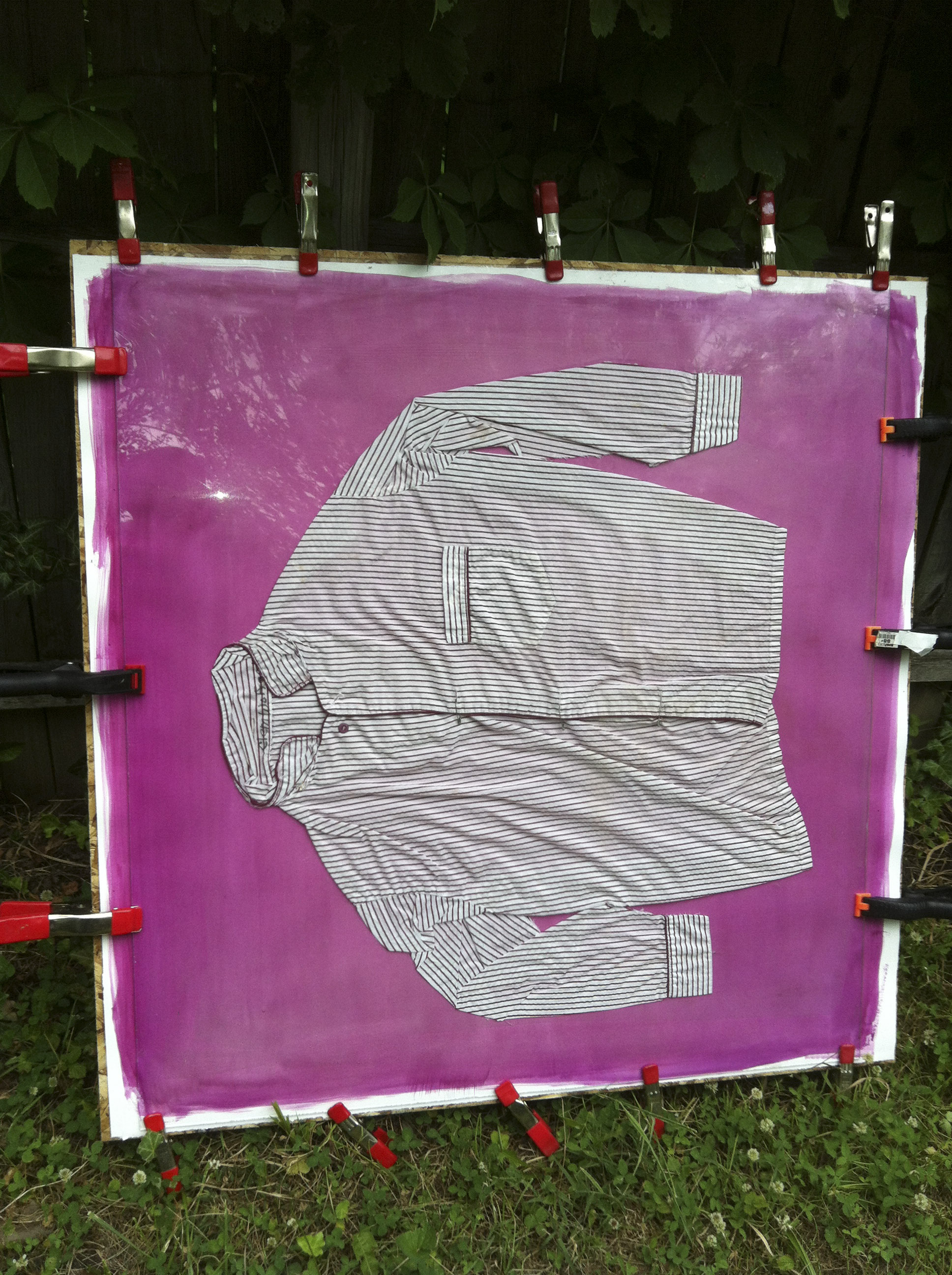
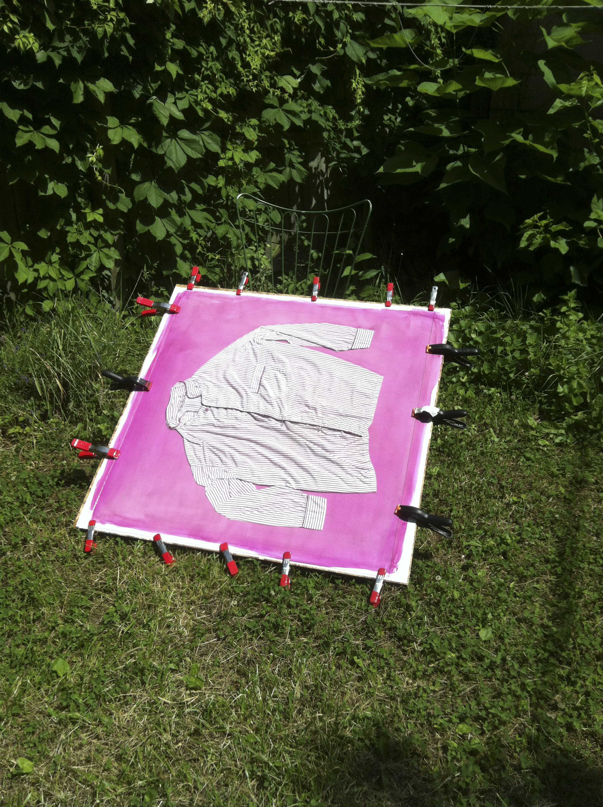
If you look at the lower right corner you can see rain did make its presence known despite wrapping the "contraption" in plastic. The contraption is usually a thin sheet of OSB, the paper coated with pigment, the garment, and Plexiglass all held together by spring clamps. The spring clamps show up occasionally around the periphery of the finished anthotype. Bridgette has described them as giving the finished piece a rhythm. I use to hate the artifacts they left behind, now I am kind of digging them. 

This anthotype was made with the same emulsion as the "Little Gown" anthotype but I kept the red tulip color by adding a bit of citric acid to the emulsion. Normally this paper (Arches Cover) and Fabriano Artistico have a bit of buffer that pushes the color to the blue end of the spectrum. Flower pigments act as a pH indicator for naturalists. I have even made purple iris pigment red. 


This is "Red Tulip (acidic) Peignoir #1". 51" (H) x 42" (w).

Speaking of iris pigment. I raided the last ones today. I have a bit frozen away and two sheets already coated one of which is exposing right now. I see plenty of purple gowns, peignoirs and pajamas in the future.


Tuesday, May 21, 2013

red state, blue state


The other anthotype involves the use of a nightgown purchased off eBay from a woman living in Alabama. This anthotype also invokes the red tulip emulsion but you may notice it looks a bit like cornflower blue. I noticed in 2011 when I had access to the rose garden in Boston that a red rose emulsion would be shifted towards blue. I speculated that it was the buffering in the paper or perhaps as the emulsion oxidized it became more alkaline.

The one thing that supports this idea is the addition of citric acid to the emulsion. Instead of heading towards blue, the acidified emulsion stays red. The large peignoir antho was prepared this way. The little green nightgown was not. BTW, both show significant fading as of Tuesday and they only went out on Sunday.

Regarding the little green nightgown, there was a Post-it note included with the  garment. It read: "Please take care of this little dress. She's been in our family for sixty years."

I am not going to reveal to the seller that I am leaving it out in sunlight for days upon days but I might mail her a snap of the finished anthotype. 


Saturday, May 18, 2013

a medium for the young

 Grinding up flower petals into pigment (actually an aqueous emulsion) is time consuming and feels like its backbreaking. It's more like back aching. Hence it is a photographic medium for the young if they have the patience. 

I've been stuck working on the red tulips since I gathered them last week and tried to combine them with an under painting (yes, I borrowed a painting term) of beets (from a can). I suspect the salt in the canned beets is the heart of the lighting problem. I will test this out later in the summer once other projects get completed. 

While I was wrestling with the beet / tulip mix I began coating two separate sheets of paper, one Fabriano Artistico hot press and the other Arches Cover.

Each has gotten about 5 coats of red tulip emulsion. Besides the paper difference, I also acidified the tulip emulsion for the larger (Arches Cover) sheet which is what the image below is showing. It is a bit streaky and it has been difficult handling a 50" x 42" sheet  of paper. I've been coating it outside and transporting it back to the garage to dry. 

There is also a bit of debris (think sediment) in the coating. I resorted to an alcohol water mix at the end to pull out enough pigment to cover both sheets with several coats. This usually shows up when using Everclear to pull pigment from flower petals. 

Maybe tomorrow I will get to assembling the anthotype for exposure. I still have to cut a sheet of plex to fit the backing board and create a water tight covering for the whole thing in case I can rescue it from a downpour.

Tomorrow I will reveal what the tulip anthotype is going to be. There actually should be two going out.  I am moving on to women's sleepwear for most of this summer's anthotypes. There goes any art cred I may have had. 


Wednesday, June 6, 2012

Progress Report

June 02
June 03
June 05
June 06
June 6th, detail
Lot's of pictures showing the progress of the fading and small misfortunes.

The garment is slipping a bit from bringing it inside in the evening and taking it out in the morning. Addtionally yesterday there was  a small downpour. This is something I wanted to introduce to the image but it is a bit different from the first Clem Wolfham. The image is being exposed sideways which is a "number of clamps" and "size of plexiglass relative to the plywood backing" issue. So the drips run perpendicular to the way I would like to introduce these marks. Additionally the plexi doesn't cover the entire surface area of the paper so the pokeberry emulsion has completely run off the paper in these areas.

I am getting closer to exposing the fabric of one of the anthotype lab coats. Now I just need to teach myself to sew and maybe I can pull this off.

Saturday, June 2, 2012

sun spot

Notes on the limited sunlight in the yard: probably closer to just five to five and one half hours of sunlight unattended in the backyard.

Yesterday's pic showed the Anthotype in the sunny corner of the yard at 10:48 a.m. Today's image was taken at 4:48 p.m.

20120602-224300.jpg