Here is an installation view, photographed by Bridgette Bogle, of Rose Red Pajama Pants which is on view at Sinclair Community College's Triangle Gallery. It is on view "sometimes", if one is willing to open the black curtains. This is an idea I appropriated from a traveling exhibition of William Henry Fox Talbot's Callotypes and paper negatives on view at the Museum of Photographic Arts in the late 1990's. There are hooks on either side to keep the curtains open so that viewers can step back from the work to get a proper view. In borrowing the Chinese proverb "the faintest ink is more powerful than the best memory, I will substitute fugitive or transient. Given enough time and exposure, these transient pigments will become the faintest of inks and may then be hardly better than the best memory.
art and photography exhibition news, updates and reports from the studio of francis schanberger. www.francisschanberger.com
Showing posts with label Summer Residency. Show all posts
Monday, September 12, 2011
the faintest ink
Here is an installation view, photographed by Bridgette Bogle, of Rose Red Pajama Pants which is on view at Sinclair Community College's Triangle Gallery. It is on view "sometimes", if one is willing to open the black curtains. This is an idea I appropriated from a traveling exhibition of William Henry Fox Talbot's Callotypes and paper negatives on view at the Museum of Photographic Arts in the late 1990's. There are hooks on either side to keep the curtains open so that viewers can step back from the work to get a proper view. In borrowing the Chinese proverb "the faintest ink is more powerful than the best memory, I will substitute fugitive or transient. Given enough time and exposure, these transient pigments will become the faintest of inks and may then be hardly better than the best memory.
Saturday, August 27, 2011
video killed the alternative processes brown dwarf
During the summer residency, I was able to work with Emmanuel College's Nick Pizzolato which resulted in three video shorts. Please visit http://www.vimeo.com/27244003, http://www.vimeo.com/27243664 and http://www.vimeo.com/27243001 to listen to me talk about vandyke brown prints, polaroids, and anthotypes.
Emmanuel College | Artist in Residence | Frank Schanberger from Emmanuel College on Vimeo.
Thursday, August 25, 2011
It's my pants party part II
Here is pants party number #2 which is an interesting creature. Part failure. Part discovery.
The yellow flowers I chose, Rudbeckia Hirta, surprised me. I had expected an image of a pair of pants in the bright yellow color of the flowers on a light ground. I got an image of pink pants with light folds and a medium density ground.The pigment faded to some degree and also changed color. There is also evidence of a negative image which is visible in the folds of the pajama pants and the less layered areas of the garment. The three areas of density are: the folds which are the least dense. The midtones which are mostly the bleached-away ground and the darkest areas which are the least layered areas of the pajama pants.
See the detail image below.
Wednesday, August 24, 2011
Pants Party
Last night I did a bit of art documentation including a painting by Bridgette and lots of the anthotypes from the residency. Here is one of the more successful pants anthotypes made using rose petal emulsion on Arches Cover. The exposure was about 13 days (it came down on August 17th, a day before I left Boston).
Tuesday, August 23, 2011
male art or completion is in the eyes of the receiver
Male art (I used ken doll bathrobe) or, more accurately, mail art is a fitting end to the residency. As part of an exchange with friends left back mostly in Ohio, I promised handmade postcards if they put together a mixed CD of what they were listening to. I got beautiful compilations from Dayton, Columbus and Baltimore which went a long way to making the tedious task of grinding plant pigments or meticulously washing Vandyke Brown prints more pleasant. I was at a loss for ideas. What should I send my DJ's back in return for their contribution. Initially the postcards were going to be small Vandyke Brown prints, then it became anthotypes, and then I just ran out of time and good sunny days with which to expose. Artists don't solve problems, they make them and sometimes, if they are lucky, they get someone else to solve the problem.
I sent my three collaborators a rose petal emulsion coated piece of Arches Cover covered by taped on transparency of an image appropriated from an Ebay auction. The image is a Ken doll bathrobe (in keeping with my somnambulist theme).
The mail art cards are a work in progress to be completed by the three recipients. They all need a little bit more exposure before the transparency is separated from the anthotype coated paper. Maybe another week in a sunlit window. Perhaps one or more of the three recipients will elect to not put the anthos in the window and not separate the transparency from the paper. They could be done, after all isn't completion is in the eyes of the receiver?
Labels:
anthotype,
Emmanuel College,
mail art,
postcard,
rose petal,
Summer Residency
Saturday, August 20, 2011
the grass is greener on the other anthotype
Last night Bridgette and I got back into the big D (Dayton) after an art pickup detour in Columbus. It's all a blur from trying to get onto I-90 from the Fenway in Boston (my rudimentary navigating skills) to finding a motel in Bath, NY to the truck accident traffic 90 miles north of Columbus. We did get a chance today to visit the members show at DVAC on its last day. David Crowell's framing of "Apple" looked fantabulous especially the cream color of the support to which he floated the image. If I didn't say it before, I wouldn't have been in that exhibition if it hadn't been for the dogged effort of Bridgette convincing me to enter a piece, taking it to Custom Frame Services, and carting it over to DVAC (twice).
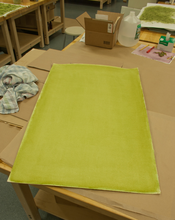
A couple of days ago I hinted at a discussion of the grass anthotypes or a least some better images of the two I made. I still need to properly light and document these pieces but below are the initial attempts at documentation. The first image is the grass emulsion brushed onto a cold press, heavy weight paper from Marco's dollar annex. I did push the exposure a bit far so it really reads as a ghost of an image, more drawing than photograph. The anthotype is of a Victorian sleeping dress.
The second grass anthotype was made by pressing wet clumps of grass (poultice) onto the paper. It is a contemporary mens' pajama top.
A couple of days ago I hinted at a discussion of the grass anthotypes or a least some better images of the two I made. I still need to properly light and document these pieces but below are the initial attempts at documentation. The first image is the grass emulsion brushed onto a cold press, heavy weight paper from Marco's dollar annex. I did push the exposure a bit far so it really reads as a ghost of an image, more drawing than photograph. The anthotype is of a Victorian sleeping dress.
The second grass anthotype was made by pressing wet clumps of grass (poultice) onto the paper. It is a contemporary mens' pajama top.
Monday, August 15, 2011
it's a family affair
Tomorrow, or rather today, is the last day of the residency. The four artists are scheduled for an exhibition (one day only) and reception from 4-7 pm on the fourth floor of the Administration building. I am showing five of the anthotypes including two of the grass emulsions which turned out very different from each other. I will elaborate in a post later this week, time permitting. In the meantime, here is a tease for the exhibition tomorrow: the rose and grass anthotype next to each other. Looking at all of the anthotypes on the wall, it is a family affair and they all are somnambulists.
Wednesday, August 10, 2011
introducing a new kallitypist
![]() |
| first frame of Sasha Ndam's portrait session |
Fewer days remain of the residency, especially studio days. Today, tomorrow, then clean up and pick up Bridgette (Bogle) from the airport. After that, except for the Emmanuel College Artist in Residence Exhibit on Tuesday, I will be a Beantown tourist.
Monday I was in assistant mode. I worked with Darien Johnson on a project in which transparencies are viewed simultaneously to deconstruct and construct the image for the viewer depending on where they stand to look.
That was early afternoon. Later that day I met up with Sasha Ndam who is a student in Cynthia Fowler's Contemporary Art and Artistic Practice class. She asked me to help her create a portrait of herself in Vandyke Brown. Except for the camera and Photoshop work Sasha chose the image and did all of the chemistry work herself. This in effect makes Sasha a new Kallitypist (vandyke brown is one of the kallitype processes). I was what could be described as her historical photographic processes consultant. In my dealing with the students in Cynthia's course, Sasha has seemed the most engaged with what the four of us artists in residence are doing (she asks good questions). Look below for an example of her work.
Sunday, August 7, 2011
In case you were wondering...
On my plate is the making of three postcards destined for friends who sent me a mixed tape (CD) to keep my ears happy this summer. Thank you for the tunes. I haven't forgotten my promise and that's what this entry is about...partially.
Anyone who dives whole heartily into the wonderful world of anthotypes will at some point wonder about their lifespan or more specifically, how ambient room light may affect the image. I decided to test out a fluorescent light fixture here in my studio by using the it as an exposure source for paper that has just been coated with red rose petal emulsion. I've stacked boxes on top of boxes on top of a cart directly below a ceiling light I can't shut off. The anthotype will get exposed to light around the clock, 24/7.
What is being exposed? Why the very postcards I promised at the beginning of my residency! What is the image of? Only the three people who responded to the Mixed CD request will find out. For a hint, see the picture below. Just in case this doesn't create much of an anthotype, I will also put an rose petal emulsion paper and light resist up in a south facing window in the science wing (or perhaps set up another outdoor frame). I'll know in 24 hours how practical the "stack o boxes" is going to be as an exposure method. Officially, I began the exposure at 6 pm on August 6th.
Saturday, August 6, 2011
no plum puns here
A little break from the anthotypes. Here is a companion Vandyke brown print for apple which I will simply title plum. Here is the back story: the fruit was rescued from the Emmanuel College cafeteria fruit bins. The freckled pattern seemed like it would be a good subject for the scanner and, eventually, the Van Dyke brown process. This is a test print (8.5 x 11) which has a strong contrast in the original which I've toned down a bit in the scan seen here. The final size will be approximately 16 x 20 inches.
Wednesday, August 3, 2011
Purloined and Purchased
I think the hardest thing to admit to oneself is that it is OK to start over. The 8 layer purple is a case in point. I could pursue the repair of the water damage or I could gather up a 115 or so purple flowers and begin from scratch, mortar and pestle to the blossoms, and coat a new sheet of paper. Two days ago I would have been stubborn enough to keep going with the repair, and I did work on it Tuesday night and Wednesday morning.
Something has changed. A new love has come into my life and its name is Arches Cover, all 10 yards (by 52 inches). It was delivered about noon yesterday. Imagine me carrying it up five flights of steps with a purloined sandwich from an unattended lunch buffet cart because that’s what I did. There must be a punishment in Hades for those who steal sandwiches thinking it is part of their eccentric artist persona. If there is it must be carrying a roll of paper and a plate of food in one hand only to reach a summit, losing both and having to go back and attempt the task all over again. I got the lunch safely up the stairs, a half of a tuna sandwich on whole wheat, half a turkey and cheese on white bread, and some potato salad. The best part was that it was free.
The new paper works extremely well with the rose petal emulsion. It is buffered alkaline so it shifts the slightly acidified emulsion from red to a cooler red, almost fuschia. The density is beautiful. It looked great after two coats but then I went too far by making it a bit streaky with a third coat.
Now I want to try this new paper with the purple. Just a small sheet to start out but it would be nice to throw another purple in the window and take out the pressed on grass poultice anthotype that has been exposing for about six days. I predict a new round of gathering purple flowers is in my near future.
Tuesday, August 2, 2011
Chance Does Not Favor the Unprepared Anthotypist
Today's report from Emmanuel College is bitter sweet (mostly bitter). I have been working with a purple flower emulsion obtained from an annual flower planted around campus (that's the sweet part; it is a really beautiful pigment) which I decided to combine with a botanical positive transparency of the actual flower. The paper I coated represents about 8 coats on a 16 x 20 sheet of paper (which used up about 100 cc of purple solution). A brief downpour while I was making green chile enchiladas for the artist dinner (my turn to cook) caused a bit of water to reach the paper inside a 16 x 20 picture frame and destroy the negative. I am attempting to recoat the paper to minimize the water marks but the negative will have to be reprinted. There was a barely visible trace of the anthotype image on the paper when I took the picture out of the frame to ascertain the amount of water damage. I am out of purple so it will have to be some of the red rose petal emulsion on top of the purple. More purple emulsion could be made but I am running out of days with which to make my exposures here in Boston.
I'll sleep on it. Pictures of the little tragedy and how my decision may have made things worse tomorrow.
Labels:
anthotype,
Emmanuel College,
purple,
Summer Residency
Monday, August 1, 2011
Anthotypes Gone Wild
![]() |
| windows as of August 1st |
Down with the old. I will remove the yellow anthotype tomorrow. Not terribly optimistic about its success since the yellow ground has turned more orange instead of fading. Up with the new. The painted on grass emulsion with a vintage child's sleeping gown was installed at noon today. It is in the far left window, the middle yellow (pajama pants) one is at about two weeks and the right one is at two days exposure.
![]() |
| The painted on grass emulsion with a vintage child's sleeping gown |
Saturday, July 30, 2011
Green Go
![]() |
| The wet grass poultice was directly pressed into the paper. |
Here is the fourth anthotype; one of at least two made with grass pigment. This one is grass stained instead of a brushed on liquid due to the qualities of the paper. It was tedious but [I hope] it will introduce artifacts from the the hammering of the grass poultice directly onto the paper. The other grass anthotype to go in the third window (closest to the brick work in the last picture) on Tuesday will have a brushed on emulsion.
Labels:
anthotype,
Emmanuel College,
grass stain,
green,
pajama,
Summer Residency,
window view
Friday, July 29, 2011
always greener on the other side
You may be familiar with the expression "The Grass is Always Greener On the Other Side". Imagine a 40" x 36" sheet of paper in which the green of the grass stain is greener on one side. Imagine me in my studio wrestling with said paper. I've unintentionally created, at least as of this afternoon, an homage to Mark Rothko. Below is an image from last night.
As of a few minutes ago I think I corrected the issue. Now I just need to remove the larger chunks of grass that I don’t want in the final photogram. The rose petal anthotype came down last night. I haven’t had time to document it but take my word, after an 18 day exposure it looks fantabulous. During the class visit to my studio, Cynthia Fowler noted appearance of a family of anthotypes in the making.
Now for a little shameless self-promotion. The Ohio State Fair Fine Arts Exhibition is now open and will run until August 7th, 2011. Juror Eric Weeks has selected “Apple” for one of the three Juror’s Choice Awards in the professional division. For the complete list of award winners in both the professional and amateur divisions, please visit http://theohiostatefairfineartsexhibition.blogspot.com/2011/07/2011-award-listing.html.
As of a few minutes ago I think I corrected the issue. Now I just need to remove the larger chunks of grass that I don’t want in the final photogram. The rose petal anthotype came down last night. I haven’t had time to document it but take my word, after an 18 day exposure it looks fantabulous. During the class visit to my studio, Cynthia Fowler noted appearance of a family of anthotypes in the making.
Now for a little shameless self-promotion. The Ohio State Fair Fine Arts Exhibition is now open and will run until August 7th, 2011. Juror Eric Weeks has selected “Apple” for one of the three Juror’s Choice Awards in the professional division. For the complete list of award winners in both the professional and amateur divisions, please visit http://theohiostatefairfineartsexhibition.blogspot.com/2011/07/2011-award-listing.html.
Thursday, July 28, 2011
Grass Green and a Fugitive Pigment
They cut the grass on the Emmanuel College campus yesterday so I went into manic mode. Wet grass clippings is chance favoring the prepared studio artist.
Mainly pictures this today. After an initial success, I have been struggling with using grass as a pigment for the Anthotypes. The first one, because of the quality of paper and five coats, worked out well. This was coated days ago before the lawn mower cuttings became available (yesterday). It is just waiting for the subject to arrive in the mail which is the fodder for a future blog entry. The second and third attempts are another story. I will let the captions do the talking. Besides the green, I have a discovery to report. The rose pigment is very sensitive to ambiant light i.e. fugitive! Please see the last picture.
![]() |
| The first attempt at grass which worked out well due to five coats of emulsion and the quality of the paper. Note the two other anthotypes in the upper background. |
![]() | ||
| The Utrecht drawing paper soaks up emulsion and shows streaks. This is actually grass poultice pressed on top of the paper. In the photo above you can see this along with the second attempt. |
![]() |
| Red rose pigment exhibiting signs of pattern fading after two weeks exposure to room lights. |
Labels:
anthotype,
Emmanuel College,
grass,
green,
pink,
rose petals,
Summer Residency
Wednesday, July 27, 2011
Experiments from the Garden of Roses, Part II
Anthotype science. I like this kind of stuff.
The rose petal extract demonstrates a classic pH indicator color change. I wish I had a pH meter to compare my guesses but for now these estimates will have to do. I noticed that when I washed out anything that had been in contact with crushed red rose petals, it would turn the water blue which would be around pH 7. Last week when I suspected the leftover rose petal extract was oxidizing to a brown, I added a classic food preservative, citric acid, to the fresh rose petal emulsion. It went from a cool red (pink red) to a warm red (crimson). Yesterday evening I again added citric acid to the latest batch of red rose petal emulsion and saw the warm red effect. In washing out one of the beakers I created about 3oo cc of faintly blue water into which I added a pinch of citric acid. It shifted the water to a faint red before it went clear. Now the question is, what was the pH of the pinch of citric acid in water that I created? Probably pH 4-5.
In creating some green Anthotype emulsion from grass, I noticed that adding citric acid created more of a brown green or olive color and possibly contributed to flocculation. For the grass I am probably going to just use distilled water and crushed leaves (blades). As of yesterday, the sheet of paper I have coated has about 5 coats of green applied to it.
Pictures soon. Of immediate concern is tracking down some coffee this morning.
The rose petal extract demonstrates a classic pH indicator color change. I wish I had a pH meter to compare my guesses but for now these estimates will have to do. I noticed that when I washed out anything that had been in contact with crushed red rose petals, it would turn the water blue which would be around pH 7. Last week when I suspected the leftover rose petal extract was oxidizing to a brown, I added a classic food preservative, citric acid, to the fresh rose petal emulsion. It went from a cool red (pink red) to a warm red (crimson). Yesterday evening I again added citric acid to the latest batch of red rose petal emulsion and saw the warm red effect. In washing out one of the beakers I created about 3oo cc of faintly blue water into which I added a pinch of citric acid. It shifted the water to a faint red before it went clear. Now the question is, what was the pH of the pinch of citric acid in water that I created? Probably pH 4-5.
In creating some green Anthotype emulsion from grass, I noticed that adding citric acid created more of a brown green or olive color and possibly contributed to flocculation. For the grass I am probably going to just use distilled water and crushed leaves (blades). As of yesterday, the sheet of paper I have coated has about 5 coats of green applied to it.
Pictures soon. Of immediate concern is tracking down some coffee this morning.
Labels:
anthotype,
Emmanuel College,
grass,
ph,
rose,
Summer Residency
Saturday, July 23, 2011
perhaps something in purple?
Here is the second anthotype taken down from the window last Thursday. A few reviews alluded to drawing characteristics. It is a photogenic drawing (in purple). The iris petal emulsion was applied drop by drop (yes, I’m nuts) onto Kochi washi paper. Hence the pattern. The pajama was red fleece with trains and no name on it. If you have a suggestion for a title, I’m all ears.
BTW, I have been adding a dash of citric acid as a preservative to my latest flower pigment emulsions (in solution). Today I noticed that the red roses I was grinding up returned to their warm red shade with citric acid instead of the cooler red / purple with just water.
Labels:
anthotype,
Emmanuel College,
iris,
kochi,
photogenic drawing,
photogram,
purple,
Summer Residency,
washi
Friday, July 22, 2011
Mulberry Pigment Print
This is the first anthotype to be completed at the residency. Mulberry pigment coated onto Utrecht drawing paper and exposed for 27 days (with about 5-7 cloudy days). Tentatively titled "Charles Tesconi". The yellow one is now installed in the window and appears to be fading quickly. The rose petal anthotype should be ready for unveiling next Thursday.
Labels:
anthotype,
Charles Tesconi,
Emmanuel College,
mulberry,
Summer Residency
Saturday, July 16, 2011
Wall Power (while I’m away)
Besides clearing out my old office, I managed to make some new Vandyke Brown prints before the long drive out to Boston. One of which is now in two group exhibitions. Apple is part of the Dayton Visual Arts Center’s Annual Members Exhition which has the theme Light. The exhibition opened last night and I was informed by phone that it won first place (the Lombard award) and was purchased. Perhaps this one has real “Wall Power”. Thanks to my partner in life, Bridgette Bogle, who convinced me to submit a piece (remotely) and ran the photograph over to David Crowell’s Custom Frame Services. Apple is also on display at the Fine Arts Exhibition in the 2011 Ohio State Fair.
I am sure Dayton Visual Art Center will have documentation in the near future of last nights opening. In the meantime you can see a simulacrum of Apple here.
Subscribe to:
Posts (Atom)