
Friday, July 18, 2014
a good studio day
Today, I pulled four prints which, in antho typist's language, translates to "stopping" an exposure. Most are life-sized but this tiny one is from a Barbie doll. The scale would be perfect for mail art if I could make many of these. The size is about 3 x 5 inches and the anthotype was made using leftover beet root. The exposure took less than a week.

Wednesday, July 16, 2014
Relatively Easy
It may seem like I only do anthotypes. My studio practice lately seems to confirm this. It is summertime and the anthotypes are easy. Relatively.

I just rediscovered my second stash of spring clamps which means that I can put together a lot of anthos at once. One of the pigments I am working with comes from some old beet root bits like the root and just below the stalk. It is a relatively fast pigment. In the picture below, the new anthotype just went out this morning around 9 am. The bedjacket anthotype on the right has been getting sun off and on since last Friday at 10 am.
There may be quite a few of the square ones this summer. So far I like the shape better than the long rectangle.
Monday, July 14, 2014
relative motion in print
Last weeks Dayton City Paper, our free weekly paper, published a review of the zoetropes on display at the Dayton Art Institute's Experience Center. The review is based upon an interview of Bridgette Bogle and myself by Susan Byrnes, a sculptor I have shown with in the past.
.JPG)
Tuesday, July 8, 2014
I lost my heart


Wednesday, July 2, 2014
Bed Jackets Times Two
It is difficult to know where to start, when I haven't blogged about my making in three months.


I am currently using red tulip petals collected during early May. Truly gleaned because allof the petals were on the ground. The ones that were too damp, we're cleaned in water and ground up in a mortar and pestle. That first red tulip anthotype of the year was one of two images I've made involving two bed jackets. The exposure was stopped late last month and is a bit more narrative than the first double bad jacket image (made from yellow onion skin).
Below are both of the images. Top: yellow onionskin "Two Bed Jackets". Bottom image: "Puppet Show" in acidified red tulip.
Wednesday, April 9, 2014
hats in relative motion
I have noticed that when sitting down to eat with friends that conversation drops off relative to the flavor of the food. If the food is prepared with love and eaten by individuals with a strong appetite, exchanged words tend to be rare.

Maybe that makes sense.
I use this as an analogy to explain the lack of reports from the studio. I have been busy with a few exhibitions and my second collaboration with Bridgette Bogle. This one involves zoetropes. Four of them. Below is a raw series that will include the use of color over the silhouetted figure.
Saturday, March 29, 2014
the return of the return of Dr. Frangst
My projects typically have a run of about four years before transitioning to the next body of work. From the summer of 2001 until about 2006 I worked under the rules of staged cyanotype self-portraiture creating a fictional character name Dr. Frangst. The project came to a stand-still in late 2005 when I replaced the character's usual white lab coat with a cyanotype photogram coat with gingko leaf patters covering it. I made a few more images after that but nothing really "took". Gingko Photogram Lab Coat is currently on view at Kenyon College in an exhibition titled Material Message curated by Molly Bondy and Marcella Hackbardt. The exhibition can be found Kahler Gallery which is in the Studio Art Building and will be on view now through April 12th. Kenyon College is located in Gambier, Ohio.
Other artists in the exhibit include: Brian Andrews, Cheyenne Cardell, Ashley Cummings, Dennis DeHart, Kelsey Dillon, Kate Fraiman, Meredith Friel, Jon Funder, Rory Hamovit, Clare Hodgdon, Sarah Kaufman, James Luckett, Jack McKenzie, Ashley Moore, Elizabeth Myers, Patricia Lois Nuss, Selina Roman, Jacinda Russell, Ally Schmaling, Morgan Ford Willingham, Emily Witosky, Zeslie Zablan, and Maria Zarka.

Other artists in the exhibit include: Brian Andrews, Cheyenne Cardell, Ashley Cummings, Dennis DeHart, Kelsey Dillon, Kate Fraiman, Meredith Friel, Jon Funder, Rory Hamovit, Clare Hodgdon, Sarah Kaufman, James Luckett, Jack McKenzie, Ashley Moore, Elizabeth Myers, Patricia Lois Nuss, Selina Roman, Jacinda Russell, Ally Schmaling, Morgan Ford Willingham, Emily Witosky, Zeslie Zablan, and Maria Zarka.
Thursday, March 27, 2014
A sensitive man
Yes. I am a sensitive man. Last month I ran into a lot of trouble trying to ship Iris Peignoir with Hidden Shorts to Arizona in a frame. I packed it so that it would be within UPS's height and girth restrictions but my avoidance of dealing with the UPS store resulted in a lot of driving around and a lot of packing and unpacking of a large box with a smaller box in the parking lot outside the UPS customer center.
Severely defeated, I called up Gina at Art Intersection who gave me the go-ahead to send the unframed piece in a tube. When considering fourteen dollars vs. 200 plus dollars and all the heartache, my artistic vision is compelled to be OK with hanging a fugitive work on paper on the wall unframed.
Which is how it is being shown at Light Sensitive on view at Art Intersection now until April 19th. The exhibition juried by Tom Persinger of f295 is billed as a celebration of images from the darkroom. There is nothing dark about the grassy area I exposed this piece in during three weeks of Vermont sun. But it is light sensitive.

Severely defeated, I called up Gina at Art Intersection who gave me the go-ahead to send the unframed piece in a tube. When considering fourteen dollars vs. 200 plus dollars and all the heartache, my artistic vision is compelled to be OK with hanging a fugitive work on paper on the wall unframed.
Which is how it is being shown at Light Sensitive on view at Art Intersection now until April 19th. The exhibition juried by Tom Persinger of f295 is billed as a celebration of images from the darkroom. There is nothing dark about the grassy area I exposed this piece in during three weeks of Vermont sun. But it is light sensitive.
Wednesday, March 26, 2014
respond in kind
I had an interesting twenty minute session with Mary Virginia Swanson during session two of Fotofest's 2014 Meeting Place. MVS is one of the most down to earth and knowledgeable consultants regarding the business of marketing photography. She didn't have the opportunity to go over my website but did discuss photo books as a better "leave behind". One thing stuck in mind from the session. The concept of linking back. This can be considered a twenty-first century version of "respond in kind".
In February I had the good fortune to discuss my photographic projects with Lauren Pearlman Sugita aka Paperwoman who is the heart of Paper Connection International. This is where I purchase the Kozo Unryu for the Vandyke brown prints. She ended up selecting me to be her artist of the month which resulted with an entry for my photography on her blog.
It is now March and Lauren is featuring Joan Son as her March artist. After meeting with Mary Virginia Swanson I felt compelled to do a belated link back.
February Artist of the Month
and the blog front page can be reached here.
In February I had the good fortune to discuss my photographic projects with Lauren Pearlman Sugita aka Paperwoman who is the heart of Paper Connection International. This is where I purchase the Kozo Unryu for the Vandyke brown prints. She ended up selecting me to be her artist of the month which resulted with an entry for my photography on her blog.
It is now March and Lauren is featuring Joan Son as her March artist. After meeting with Mary Virginia Swanson I felt compelled to do a belated link back.
February Artist of the Month
and the blog front page can be reached here.
Tuesday, February 18, 2014
Old Habits

In one portfolio review last October I was cautioned against
using the scanner as a photographic instrument because there are a lot of
artists now using it. The reviewer was hinting at push back. While I took that
criticism to heart, I ended up creating my favorite version of the buckeye,
shell and all, with the scanner. Old habits.
I did print it on the Tosahakkinshi (the tosa washi) made
for the exhibition in Ino Town, Japan at the Paper Museum.
Here is a scan of it. I've decided to submit this for the
Dayton Visual Arts Center's annual auction. It will be the first time this
paper will be seen in the mid-west.
Monday, January 20, 2014
slower than molasses in january
Yes, I do camera work. The view camera has been described as a slower way of working than smaller, hand held cameras. In the hands of a slower worker, it's like pouring molasses on a winter's day.
Saturday I loaded film holders.
Sunday I took up all afternoon working with buckeyes and using the 8x10 view camera with the extension rails.
To compound it all, I used a Rodenstock Imagon 360mm lens. Mine has no shutter and the unusual aperture set up is initially a bit confusing.
Today I developed in camera paper positives.
I am still uncertain as to the final arrangement. I like to challenge myself with negative space but find myself drawn to the initial arrangement which was lost due to camera set up, difficulty of working with the Imagon and the rickety nature of the buckeyes (they are in pieces and barely want to stay put).
 |
| original arrangement |
 |
| view camera set up for final image |
 |
| front view of the imagon |
 |
| uncropped in camera paper positive |
 |
| detail from the above image |
I do like the look of the eye in the original set-up. I think I will revisit this image once I get a few of the sheets of film developed. In hindsight, I don't think the soft focus lens was the best choice so I may go back and expose it with a sharper lens and with more depth of field.
Some notes to keep on hand:
I photographed from about 3 pm until 4:45 pm yesterday. The paper positive exposures were made with window light around 4:30 pm and I rated the film at about ISO 3. I'm thinking that it should be rated about ISO 1.5. The first exposure was about 8 minutes. I calculated a bellows extension factor of about 4 stops and ignored any reciprocity failure for both film and paper exposures. I did a second paper negative exposure of 25 minutes. It was going to be 16 minutes. Then it was twenty which I stretched out to 25.
I was doing dishes and couldn't be stopped.
Both paper positives were developed in Sprint paper developer diluted 1:18.
Film exposures (not yet developed) were 32 seconds and 16 seconds for ISO 100 film (Shanghai?) and 16 seconds and 8 seconds for some older, fogged TMax 400.
Monday, January 6, 2014
greetings from the frozen midwest
Staying in today to avoid the wind, the wind-chill and the subzero temperatures. I even emptied my work area in the garage to make a spot for the car. That's what garages are typically designed for...the sheltering of cars, not the coating of anthotypes or UV exposure dependent printing.
It's a good day for late, late portfolio review follow-ups. I think I sent one about four weeks after getting back from Chicago. That would have been early November. I guess now they are New Year's greetings.
Next week, the Eight Annual OOVAR (Ohio Online Visual Artist Registry) Exhibition will have a closing reception on Saturday, January 11, 2014 from 2-3:30 p.m. in the Carnegie Gallery which is on the second floor of the Columbus Metropolitan Library's main branch. Included is a digital print of the (Basic) Red Tulip Sleeping Dress.
The original was just sold by Loretta Puncer's Gallery 510. It is my favorite of the anthotypes and am glad to see it go to a good home. The framed anthotypes do take up a bit of room in my studio / slash office. I really do take after my father. His office was unusable except for a small area of a table in a room full of stacks of medical journals and old mail.
No nightmarish pictures of cluttered office spaces today. Instead just a few snaps of the start of the (Basic) Red Tulip Sleeping Dress and it's final framed version.


It's a good day for late, late portfolio review follow-ups. I think I sent one about four weeks after getting back from Chicago. That would have been early November. I guess now they are New Year's greetings.
Next week, the Eight Annual OOVAR (Ohio Online Visual Artist Registry) Exhibition will have a closing reception on Saturday, January 11, 2014 from 2-3:30 p.m. in the Carnegie Gallery which is on the second floor of the Columbus Metropolitan Library's main branch. Included is a digital print of the (Basic) Red Tulip Sleeping Dress.
The original was just sold by Loretta Puncer's Gallery 510. It is my favorite of the anthotypes and am glad to see it go to a good home. The framed anthotypes do take up a bit of room in my studio / slash office. I really do take after my father. His office was unusable except for a small area of a table in a room full of stacks of medical journals and old mail.
No nightmarish pictures of cluttered office spaces today. Instead just a few snaps of the start of the (Basic) Red Tulip Sleeping Dress and it's final framed version.
Wednesday, January 1, 2014
New Year Greetings
.JPG)
New Year's greetings from the pecan groves of south eastern New Mexico!
This year I resolve to be less negligent of this blog. In past years, I actively wrote about my studio practice and exhibitions. There were many things to blog about, portfolio reviews in Chicago, an exhibition in Japan, an exhibition I curated, printing platinum palladium on a brand new washi, and lots of anthotype related exhibitions and creations.
There is more in store for 2014.
To get the New Year ball rolling, here is an image of the onion skin anthotype revealed early last month after almost two months of on again-off again exposure.
.JPG)
Tuesday, November 5, 2013
B.G.F.G.A.
News from Ohio Art League's Annual Fall Juried Exhibition.
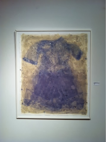
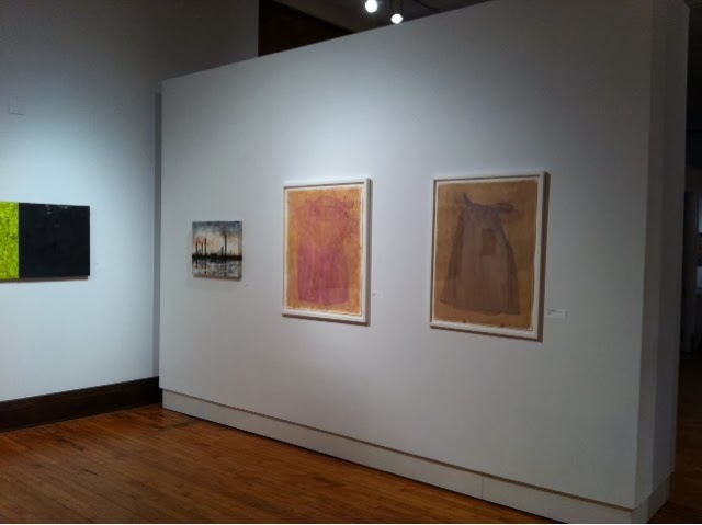
Both Bridgette Bogle and I have work in this show. Her collection of paintings, "Twelve Little Mistakes", won a second place juror's (Melissa Vogely-Woods) award. Even with the strong showing of painting, three of the anthotypes were juried into the exhibition. One of them or maybe the three together garnered a "Bad Girls for Good Art" award.
The exhibition runs from October 21–December 6. The Fort Hayes Shot Tower Gallery's schedule: 8 am - 4 pm Monday through Friday with the exception of Wednesday. The gallery remains open until 6 pm on Wednesday.
A closing reception is planned for December 6 5:30-7:30pm.

Tuesday, October 29, 2013
Complimentary Colors
Tonight, I start a long, difficult process of actively using
this blog and its mirror site as a means of communicating my artistic practice.
It’s been a busy couple of months.
Not just teaching. The anthotypes are maturing in approach
and content. I am getting influenced by the painter in my life and other
painters in my life. I think all the rubbings on the Vermont pieces were
influenced by Bridgette and I viewing the Gerhardt Richter video. Somewht
related, when someone mentions complimentary colors to you in a hallway based
upon seeing an instagram picture of a work in progress…I better take heed.
Rebecca Sargent, thank you.
Exhbition news minus pictures.
The Ino Town, Japan show ended last week. The platinum
palladium prints on the Tosa Washi may travel to Kyoto. Stay tuned.
Three anthotypes are on view in Columbus as part of the Ohio
Art League Fall Juried Show.
Three anthotypes are on view in Fixed Shadow at Wright State
University.
One anthotype (the double exposure one) will be on display
in the Soho Photo Gallery Alternative Photography competition.
I will upload pictures of the work, possibly even exhibition
documentation in the next few weeks. In the meantime, how about an early image
of a work in progress? Complimentary Clot in Saffron, photographed
October 21st.
.JPG)
Monday, September 9, 2013
take note
Camera phones present a useful way to take notes of work in progress. They are certainly helpful with a complicated photographic experiment like mixing plant pigments on top of each other.


I forgot the order I applied tulip and rose pigments to one of the anthotypes I made in Vermont. I forgot until I discovered this progression of images on the phone.
Iris on top left to right. Red rose on the bottom.
A couple of days later I had settled on creating a four square ground by applying purple iris on top of the red rose (bottom right). The top left is red rose over purple iris. All grids should have received the same number of layers.
Monday, August 12, 2013
Open Door Policy

Here in Johnson, Vermont I had grand aspirations for
a couple of projects. With just a few days left in the residency it seems to
have been one project involving Anthotypes. Through it all, whether it was
working with and saying good-bye to the July artists in residence to the
current August artists, I've kept my door open.
There has been a lot of work done, much of it mortar and
pestle drudgery. Perhaps that's one reason for the open studio. It's so much
more interesting to grind plant matter when you have something to listen to or
to talk about with visitors.
Here's a list to that I hope to write about as time frees
up:
1.
Content of the newest anthotypes: the mix of
male and female sleepwear
2.
The studio practice: 12 hours a day in Vermont
(sometimes)
3.
Slow to make fast to expose: contrasty juniper
leaves
4.
The show in Japan
5.
The Ohio State Fair
6.
Future ideas for the anthotypes / accelerating
the fade
7.
Condensation in "tarping up" the
anthos
Above is a picture of the favorite antho produced so far in
Vermont. "Iris Peignoir with Hidden Boxers"
Thursday, July 25, 2013
summer ball rolling
The last few weeks have been busy. Printing work for a show in Japan. Discovering that I was going to a residency in Vermont...last minute...due to my teaching schedule and the other Ohio artist being unavailable to take advantage of an Ohio Arts Council funded residency at Vermont Studio Center. Packing the car for less than a month of residency here in northern Vermont.
It was a two day drive and now it's two days into the residency. I did dive into work once I got here. Anthotype work. Now two are outside and a third will join them tomorrow morning.
In a previous life I was a monk sequestered in a solitary cell. Maybe I was a lonely groundhog. That's my studio practice. Twelve hour days with breaks for meals and artist talks in between. A walk here. A talk there. Tonight's lecture was by environmental artist Jackie Brookner who's work is concerned with the misperception of water as an unlimited resource.
To get the mid-summer ball rolling, here's a pic from tonight's walk near Johnson Community College.
.JPG)
It was a two day drive and now it's two days into the residency. I did dive into work once I got here. Anthotype work. Now two are outside and a third will join them tomorrow morning.
In a previous life I was a monk sequestered in a solitary cell. Maybe I was a lonely groundhog. That's my studio practice. Twelve hour days with breaks for meals and artist talks in between. A walk here. A talk there. Tonight's lecture was by environmental artist Jackie Brookner who's work is concerned with the misperception of water as an unlimited resource.
To get the mid-summer ball rolling, here's a pic from tonight's walk near Johnson Community College.
.JPG)
Wednesday, July 17, 2013
Working with Tosa Washi
How to work with Tosa Washi sans illustrations
Finally there is a sign of progress in regards to printing
on Tosa Washi. I completely revamped my approach to making negatives by
designing a QTR printer profile. Despite the recent push to use matte black ink
for inkjet negatives, I have stuck with the glossy black strictly because of
the expense of swapping out black ink on the Epson 4800. It seems to block
plenty of UV. The dried down prints show no sign of a change in Dmax in the
ground which can accompany the dark ground where the edge of the transparency
lies.
Here's a brief workflow for handling the paper, without
illustrations. At some point I will include an entry with pictures but I am
short on time which will make sense in a couple of days.
Coating 30 gsm Tosa Washi
1. I use a 3 inch wide synthetic bristle brush, which gets
primed with distilled water prior to coating. I run the brush against the sides
of the distilled water dish to discharge as much of the distilled water as
possible.
2. The paper is placed on a piece of felt. I am using an 11
x 14 inch size piece for paper that is about 9" x 12". I use two
strips of poplar weighted down with a stainless steel straight edge and a large
wrench. These go to the left and right edges of the paper to keep it from
moving during coating. I coat on the smooth side of the paper.
3. I brush initially in one direction from left to right,
dipping the brush into the palladium / ferric oxalate mix for each pass. After
creating four rows, I build up emulsion on the right side by starting at the
bottom and brushing in one direction upwards. The action of the brushing goes
from fast to slow. Fast at the start of a row or column and slower as you get
to the other side. I use about 80 drop total for the 9" x 12" size
paper.
4. I hang the paper on a clothesline, allowing it to air dry
for thirty minutes.
Print Frame and exposure.
5. I lay a sheet of card stock weight paper on the felt of
spring back of the print frame.
6. Next comes the coated sheet emulsion up.
7. I use a sheet of clear mylar as a barrier between
the negative and the coated paper. The paper has a lot of emulsion on it.
8. The negative is placed upon the mylar and the split back
is assemble together.
Exposure:
9. Exposures have been running around 60 minutes to 90
minutes in a BL fluorescent exposure unit. I do use a Stouffer's step tablet
and expose to just barely make out the distinction between step 7 and 8.
10. It is very hard to gauge exposure so I recommend smaller
coated pieces of paper as test strips.
Development and clearing:
11. I use a piece of Plexiglass that is slightly smaller
than the tray but larger than the print to transport it between trays.
12. Always, always, always have chemistry in the tray before
placing the print into the tray. The only modification to this is developer. I
place the print into a tray with the Plexiglass with 80 percent of the
developer. Once the paper has absorbed the developer from the reverse side, I
pour the remaining developer onto the surface.
13. The paper is strong but prone to damage towards the end
of clearing. I place the plexi and print into a slightly tilted tray with
running water. The water strikes the tray in the upper left corner and monitor
the print for five minutes taking care that the print does not roll up on
itself or travel underneath the running water.
14. The washed print is transported on the plexiglass to a
table. I place a piece of blotter paper on top and lightly brayer the blotter
paper. I then peel off the print from the Plexiglass and transfer it to a clean
drying screen.
The prints have a bit of texture from the drying process and
will need to be smoothed out with a clothes iron or dry mount press. Experiment
with overexposed / underexposed prints.
Tuesday, July 2, 2013
daunting task(s)
There lies in front of me a daunting task. Within this lies many little, yet no less daunting, tasks. This challenge is printing historical process photographs on a new paper that is whisper thin. Thirty grams per square meter thin Tosa Washi made specifically for a show in Inno Town, Japan.
Several things that he has incorporated into his process have obvious advantages. The bamboo rod he uses to transport the paper from tray to tray. I am opting for a sheet of clear acrylic but would love to try this at some point. I have access to bamboo skewers in the kitchen.
Charging of the brush with distilled water is one of the most sensible things I have done. This prevents the brush from soaking up all the chemistry before it can be applied to a very thirsty paper. So glad I did this right away instead of wasting paper and chemistry with a dry brush. It could have been an expensive "DERP!" moment. I will have to stock more distilled water in the work area.
Perhaps the most amazing thing I discovered from the video was the use of felt underneath the paper. This prevents the paper from creasing as brush pressure is applied to the surface of the washi. It also creates a bit of friction with two pieces of poplar at the left and right edges so that the paper stays put.
Although the paper is designed to be used with the traditional platinum and palladium printing process, I have decided to try a Ziatype emulsion on it. Zia is a less expensive way of using palladium to form an image and it prints out an image. That means less calculation to determine proper exposure and no developer which means one less tray for a paper that is very prone to tearing and fraying in water. I also have a bit of Ziatype chemistry left over from a previous project.
Below is my text target from which I will generate a curve for the Ziatype on this the Tosa Washi. I will still create palladium prints on this paper. That is Plan A. The Ziatype will be Plan B in case I am running low on Palladium chemistry and a very finite supply of paper.

I have investigated dosa as a well to make the paper respond well to various emulsions yet just as I was experiencing success, I read about the archival (acidic) issues with this method. After watching a video by the master platinum printer Nishimaru san who created this paper, I accepted the challenge of working with this paper as it is.
Several things that he has incorporated into his process have obvious advantages. The bamboo rod he uses to transport the paper from tray to tray. I am opting for a sheet of clear acrylic but would love to try this at some point. I have access to bamboo skewers in the kitchen.
Charging of the brush with distilled water is one of the most sensible things I have done. This prevents the brush from soaking up all the chemistry before it can be applied to a very thirsty paper. So glad I did this right away instead of wasting paper and chemistry with a dry brush. It could have been an expensive "DERP!" moment. I will have to stock more distilled water in the work area.
Perhaps the most amazing thing I discovered from the video was the use of felt underneath the paper. This prevents the paper from creasing as brush pressure is applied to the surface of the washi. It also creates a bit of friction with two pieces of poplar at the left and right edges so that the paper stays put.
Although the paper is designed to be used with the traditional platinum and palladium printing process, I have decided to try a Ziatype emulsion on it. Zia is a less expensive way of using palladium to form an image and it prints out an image. That means less calculation to determine proper exposure and no developer which means one less tray for a paper that is very prone to tearing and fraying in water. I also have a bit of Ziatype chemistry left over from a previous project.
Below is my text target from which I will generate a curve for the Ziatype on this the Tosa Washi. I will still create palladium prints on this paper. That is Plan A. The Ziatype will be Plan B in case I am running low on Palladium chemistry and a very finite supply of paper.

Subscribe to:
Posts (Atom)